
A Walk Through a Painting
Jun 05, 2024
It’s five AM, I have just seen the most beautiful sunrise over the Aylesbury Vale on a dawn walk and I am now sat in our tiny courtyard garden – which is bursting with summer veggies – wrapped up in thick socks and a dressing gown. It’s the perfect time to write and the perfect time to address my tardiness for the lack of blog planning this week – oops!
Sometimes things just creep up on you; that event you didn’t want to go to, the deadline after you missed the first and your Mum’s birthday. It’s fair to say that since the world has begun to breathe a little more and lives distractions can slowly make a timid reappearance, unsurprisingly my good intentions have started to slip. However, I like to think that you, dear reader, are holding me accountable for making sure I do these posts every other week; hence even if I have one reader, I’ll keep going and hopefully people will keep drawing, too!
Enough waffle, I’m not a writer I’m an artist, let’s get down to this week’s blog. You may have noticed that I release a tips blog and that is followed by a tutorial post. This is going to be the last week of that routine, I’ll be changing things up a little from now on. Partly, because these take several days to get right, (well, the big tutorials with videos do), and also because it’s a lot of content for all of you to get through and you have your own lives to be living. So, to give everyone more time to get cracking before the next tutorial comes out, I’ll be spreading the lessons over at least two weeks. This will also mean that we could tackle some bigger subjects which would be fun. Perhaps a woodland mammal for autumn…that ought to give me time to get the videos together!
This week, we are going to be taking a wee look at composition. Just like the last time, this is going to have a relevance to the following tutorial which some will be pleased to hear returns to the theme of flora and foliage. Keep reading to the end as you have a part to play in this! Composition, is an amazing tool and it doesn’t need to be a super complex algorithm to gain good results with, there are some simple rules and I’ll show you how to take certain liberties with it, too. This little tutorial really can take a well-rendered but otherwise unengaging painting into a totally different realm and wouldn’t that be nice?
The first ‘rule’ we will cover is that of thirds, something I am sure many of you may already know about. If you don’t, you’ll soon realise that actually, you do. Just think of almost any contemporary or post-Seago seascape painting. What have you got? A nice third at the bottom, or the top, of marsh, beach or sky with not a lot else, usually. If you have a third of beach at the bottom, you gain a pleasing two-thirds of the sky at the top and visa versa. We are all susceptible to this simple, yet effective, compositional tool. You can play around and make a third of beach a fifth, perhaps the bottom of the sky is a little lighter than the top, where would be a good place to transition from the dark to the light? Well, I would say at around a third, wouldn’t you?
This isn’t a new ‘trick’ it’s been used for years but it’s very obvious and easy to see in landscape paintings and photos found today in the coastal galleries. Artists such as Richard Wilson (1714 – 1782), also used this trick but like most landscape artists he liked to use thirds not once but twice. He (generally) split his landscapes into thirds horizontally for the horizon but also thirds vertically. You just take a look; you’ll often find a large dark tree or a mountain or a castle on a mountain, positioned roughly on the vertical third which segments the painting. you can see this in Seago’s work, too. We like this composition as well, it ‘pleases’ the eye and is well balanced to look at. But we want to go further, don’t we? Wouldn’t it be nice if people explored our work, took a visual walkthrough a painting? How would we go about doing something like that?
If you think about taking a walk which someone has planned for you, you are likely to have something to guide you through this. In much the same way, we want to give our audience a visual map through our paintings and I’m sure if you have a think you could come up with a few options for this. It is very similar to a map, we have some effective, simple and clear tools at hand: line, colour and negative space, (a key may be a step too far!).
Let’s say we have a beautiful meadow scene and we want people to look around the painting by ‘entering’ the painting in the bottom right and flowing up through in a lazy ‘z’ shape. We could do this by creating a trail of pink in the meadow, perhaps a pink centred daisy near the bottom right, a poppy on the upwards left slant with another a little further up to the right and finally a tall Willoweed taking you up to the left, which could just break the bank of flower heads that are clumped to form the bottom third of the painting, and, much like a Seago, the Willoweed could extend into the upper third of the sky and sit on the vertical third to do this. Wouldn’t that be pleasing?
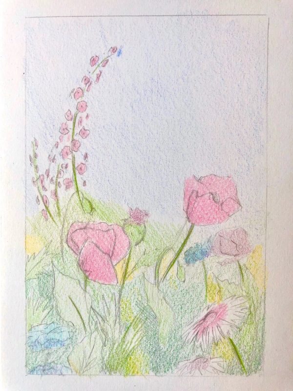
Of course, you would need more flowers in your field besides these pink ones, but perhaps these are the only pink flowers. Sure enough, you may have purple pinks or peachy pinks, but if these were the only ‘pure’ pinks, you can engineer a pathway for the eye to travel along like the red line of a map, the eye will track things which are the same. This can be a very subtle thing, you don’t have to judge your attempt as a failure if someone fails to notice this tool, in fact, keeping it played down will help your painting from looking forced. Ultimately, the painting works if it is holding someone’s attention and they like to return to look at it, compositional techniques are a big part of this. They also help to make order from chaos, which, in a busy meadow scene is certainly a plus!
This is why negative space is also a very useful tool to have. A large space with not a lot going on, such as a stretch of green for the grass or the blue of the sky, can give the eye some ‘rest’ in the painting and stop the work from being so saturated with details that you don’t know where to look as there is nothing to balance it with. However, a big blank space is also just as unnerving to the eye, there’s nowhere to go and nothing to follow, so we should use both of these things together to harmonise and ultimately balance a painting. If we have a very busy third at the bottom with lots of flowers in, then a restful two thirds on top will be lovely and compliment this detail beneath it. If the bottom third of the painting was just green for grass and the top was just blue for the sky, it would be boring of course, but if the sky had a couple of Pink Footed Geese, (or maybe a whole flock!), flying through, then the simple ground below would work well.
You can use line to do much the same as the colour in creating a map to follow, perhaps this is a more straight forward one to realise, excusing the terrible pun. Once again though, you should aim to convincingly and pleasingly nestle these tools into your painting, they support the work but shouldn’t overtake it. Taking the meadow scene as another example again, you could have the stalk of the pink daisy in the bottom right, angled lazily in towards the centre, (nothing need be overstated and glaringly obvious). The next pink flower, the first poppy, is there to bounce your eye from the left to the right and upwards, so perhaps the stalk should be hidden here, (as it would only drag you down again), and instead, the stalk of the third flower on the upper right should be a gentle line pointing from the general direction of the second flower up to the third, which it is attached to of course. The final flower, which is a tall stalk of Willoweed in the upper left, could have a gentle ‘c’ shaped lilt, emerging from the flowery mass in a gentle curve angled towards the third flower. The pink further helps this line of direction which the eye naturally follows. It doesn’t need to be overplayed but is helpful to have none the less.
You may be wondering why it is important to have all this faff, and in short, it makes your work more interesting. Let’s say that top flower, the Willoweed, has a delicate common blue butterfly perched onto the end of it but your card is also blue and so the butterfly is not prominent but the quiet star of your drawing. We would want the viewer to ‘find’ the butterfly, much like you happen upon them in the garden and creep closer for a better look, so as not to disturb it. This ‘z’ shape is like you winding your way up the garden path towards the butterfly.
Once again, you can easily see these types of techniques used in paintings for centuries, the religious works are the easiest examples to hand. If we take a quick look at ‘Psyche Honoured by the People’ Luca Giordano, you can see some familiar shapes, after a moment or two. Firstly, the column which Psyche is painted in front of takes up a vertical third, and the people on the foreground take over an uneven half of the painting horizontally which creates a composition very similar to the landscape artists. But secondly, look at all of those patterns! Don’t see them? Let me explain…
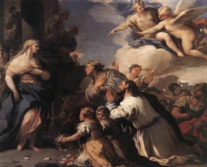
Psyche Honoured by the People – Luca Giordano 1695-7 (Wikigallery)
Although this painting is quite dull in colour by now, there are some colour tracks which we can walk through, (see the more vibrant photo below). There are two figures towards the back of the crowd both in the same dull red robe. These are the only two red areas and create a horizontal line between them, guiding you to the prominent figure of Psyche, (those little red petals on the floor also do this as they trail towards her feet.) Perhaps the most saturated, (vibrant), colour in the painting is the blue. There is a diagonal to be made here, from the slightly gentler blue of the sky to the more intense blue of Venus’s drapery down the arm of Venus to the blue drapery of Psyche, the most important figure. It also tells the story, that these two figures are in some ways connected, (Venus in fact was jealous of Psyche’s beauty which was worshipped by people and so Venus tried to order her son, Cupid, to have her fall in love with an ill-fated man…however, Cupid himself falls in love with her, excellent plan there, Venus).
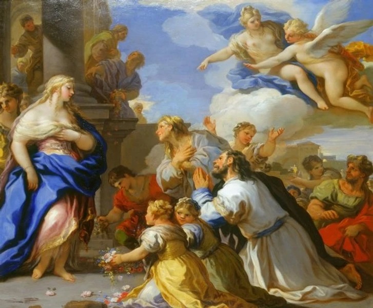 Colour enhanced version. Image from Royal Collection Trust
Then, there are all of the angles, look at the arms which create arrows pointing you towards Psyche, who is the most important figure in the painting. There are several patterns to be made here but they all keep your eye in and moving around the painting. If you look, you can see that the yellow dress of the kneeling girl with the flowers, is very light on her shoulders and that this forms a sort of line in an upwards diagonal to the man’s face who is dressed in white, some of his clothes also catching the same intensity of light. He is ‘outlined’ by the very dark garment on his shoulder which stops you drifting off out of the painting to the right and instead heading up to the woman just behind him who is also gazing adoringly at Psyche, creating a long line with her body leading closer to the main figure of the painting. You also follow the line from Psyche up Venus’ arm to her and Cupid, the next most important figures here and a crucial part of the story; look how the highlight on Cupid’s wing aligns perfectly with his outstretched arm which points to Psyche. You can see how you could ‘enter’ the painting here, too, and head straight down these lines back to Psyche. If you keep looking, you’ll keep seeing; Venus and Cupid’s legs point down to the man in red whose garment curves down to the man in white, your eye is taken up again and over to Psyche. Many Baroque paintings have these techniques in them, I often think that the human figure is used as a prop or drapery, with limbs gracefully falling this way and that to create patterns and flowing lines.
You may think that’s all well and good but your eye isn’t going logically from one shape, down to another and across and so on, hence is it really ‘real’? However, what these repeated lines and graceful curves achieve is a sort of rhythm to the painting which holds your interest. It is pleasing to you, even if consciously you aren’t sure why, and it is organised by this flowing lose pattern which prevents it becoming a huge confusing mess of figures, and, you can do the same with flowers. You can take these same ideas and put them into an arrangement of flowers. I have done some example sketches below, very simple, to show you what I mean. Next week, we will begin to ‘build’ our meadow over several weeks and let’s just see what we can do!
Below are two more compositional sketches, as you can see, these really are sketches and not at all polished or even too clear as to what’s going on. The main point of these, are to establish blocks of the important colours, where they will be and the supporting work around them. The foliage and smaller flowers can go in as green ‘mush’ for now, it hardly matters. The first is an idea for a Hollyhock, or similar, twisting upwards to the left, you are guided there by a head of similar coloured Sweet Williams, (ours did so well in the garden this year!), and it is supported by two asymmetrical thistle plants on either side of the ‘major’ pinks, as well as, a horizontal strip along the third of yellow and purple, (also complementary colours so they will as interest).
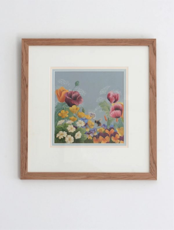
The second sketch was loosely formed around the composition used is the Giordano we studied above, can you see? Have a play with some classical art you like and see if you can’t turn them into flowers.
Your Part…
I did say way back at the start of all this early morning waffle, that you have a part to play in this meadow scene and I hope you will. I’d love it if you sent me a request for a flower to be included, (or foliage), and a photo if you have one. Perhaps you have a beautiful rambling rose we could have falling into the painting from the top, or a favourite variety of fern. Whatever it is, send it in or put it onto the Facebook page and I will pick one a week to do as our lesson.
So, it is now gone half-past six in the morning…a second draft will surely have to be done after coffee o’clock later but for now, it’s time to sit and enjoy this perfectly still and peaceful – oh, wait a minute, I’m on a farm and it’s surely waking up now with plenty of bleating, snorting and mooing to boot!
Have a wonderful few weeks everyone and should you have found this interesting or think others will, please share it around and spread the word; I really appreciate your support and am greatly enjoying the interactions on our Facebook group page, too. Do have a go at some composition sketches and see what you can create – if you can’t think of a composition, then why not start with one I’ve already done, or, take a ‘trip’ through the National Gallery’s online archive for some inspiration from those who really knew how it was done.
Stay safe, stay happy and keep drawing x
Stuck for where to begin?
Start with 4 free project outlines, ready to begin in pastel pencils straight away!
Keep your pastel pencil knowledge up to date!
Stay inspired and keep your pencil moving with inspiration and updates.
Don't worry, your information will not be shared.
We hate SPAM. We will never sell your information, for any reason.
