
An Easy Intro to Colour Theory
Jun 05, 2024
Something which long since baffled me was colour. It seems so simple at first but then you start to look, think and ultimately confusion sets in. I find that in painting, with oils or acrylics, this is particularly the case as you could mix an endless variation of blues, yellows or reds. However, pastel pencils provide an excellent place to start as we have a selection of ‘premixed’ colours to choose from, thank heavens!
Download the Ultimate Colour Wheel Chart for Free - Includes 8 Different Colour Spinners

Even so, there are still some elements of colour theory which are well worth knowing and this week I am going to introduce you to a few which will be used in the next tutorial. Lets being with the colour wheel, it’s an excellent tool to have and I thoroughly recommend getting familiar with it and printing one out. There are two different colour wheels, which is worth mentioning before we get stuck in; we have the red, blue and yellow (R,B,Y) and the cyan, yellow and magenta (C,Y,M). The latter was designed for use in the digital industry and tends to be brighter, while the R,B,Y is the ‘traditional’ wheel and the one which we will be looking at.
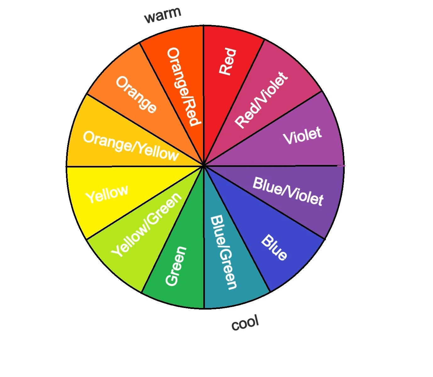
Above is the basic colour wheel which shows all of the colours moving from one colour family to the next in degrees. This is something to think about when you are drawing: do you want a gradual transition from the colour you are using into the next, or, does there need to be a dramatic jump? If you need a gradual transition, it is a good bet to start with the colour wheel as a guide for how to get from A to B.
For example, if I wanted to get from blue to red, I would start ‘warming up’ the blue towards a violet which would then transition better into the red as red and violet are also neighbours on the colour wheel.
Key Terms
Hue: A colour family such as, Red, Violet, Blue, Green, Yellow, Orange. Everything you see fits into one of these Hue families.
Colour: A variation within a hue family, for example, ‘blue’ is a hue, and within there we can have Cobalt, Ultramarine, Cyan etc
Saturation: This can also be called ‘intensity’ or ‘chroma’, just to confuse you. However, it simply refers to how ‘pure’ the colour is, is it mixed with something else and if it is, it will appear slightly grey or muddy and less powerful.
Tint: A colour with white added
Shade: A colour with black added
Tone: How light or dark something is
Warmer or Cooler?
Colour is relative, that is a big idea in colour theory and something to keep in mind, too. By this, I mean that one colour may look very red when it is put on a piece of white paper, however, when you put down on orange paper, it might now look a little more orange, or pink, or purple, or even brown. It is much like choosing the largest slice of cake, (this is an analogy I can relate to well), the first slice might be the biggest when it’s cut, but, by the time the cake has been cut up into eight pieces, another slice may have come out much larger than the first. It is all relative to what is going on around it. That red is only the most intense red on the page so long as another colour doesn’t come along and disprove it.
In much the same way, one colour is only ‘warm’ or ‘cool’ so long as the other colours support that. The colour wheel below shows the warm and cool axis, however, that doesn’t mean to say that you cannot have a warm blue. According to the axis below, a green/blue is the coolest colour, hence, a ‘blue’ will be warmer than a green/blue, same as just a ‘green’ would be warmer than the green/blue. Of course, if you put that same blue or green next to an orange, they will now look cool as the orange is a far warmer colour than either.
Using temperature variations in your painting can be really useful and the pastel pencils can make this very simple, too. You could decide to have a cool light, perhaps it was a blue-skied day and so the reflections will be blue in colour, then use your cool light grey for the highlights (230). You could then make your shadows a warmer colour by contrast and use the warm dark grey (175).
Why do this though? Because much like the difference between light and dark make up an illusion of a 3D form, adding these other differences in will make your drawing more convincing to look at. It also makes it far more interesting and allows you to access more colours, other just a flat grey or black for you darks. You could add a deep brown or purple into the shadow to contrast the cool blue light by glazing it over the dark grey.
Complementary Colours
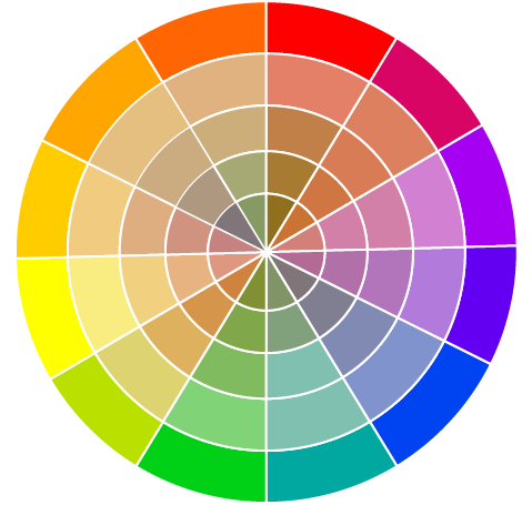
Last on our whistlestop tour of colour, are complementary colours, my favourite! I always think that the description of a colour pair by ‘complimentary’ should suggest that they are neighbours and sit very easily together, however, that is not the case. A complementary colour is a segment on a colour wheel which is directly opposite, for example: red and green, or, yellow/orange and purple/blue. They clash the most out of all of the colours on the wheel and can create a really vibrant and dynamic painting if used well.
The complementary colour wheel above shows what happens when two complementary colours are mixed together. They create a chromatic grey, which is a colourful grey. These colours can appear slightly muted or totally muddy depending on the strength of each colour. Only a little touch of yellow into purple doesn't have a huge effect, but a 50/50 strength mix with create a type of grey.
Often, you don’t need to have both colours glaring out, you might have a very subtle complementary mix; perhaps you are drawing a dog in reddish browns and so you make the shadows every so slightly blue in shade. You could do this by glazing a dark blue, such as Faber Castell 151, over your shadows. You don’t need to press hard and it will have an effect. I use this sort of idea quite a lot when choosing which coloured board to draw on. In a previous tutorial, I chose a dark green to draw the Monarch Butterfly, which is an orange/red colour. This allowed those brighter areas of pattern to really stand out against the dark green pastelmat. It’s a simple trick and can do wonders for your paintings.
The Impressionists loved complementary colours, partly because it was at this point in history that colour theory took off. Before then, colour wheels were not available and the use of colour was founded much more strongly in symbolism. Scientific colour theory was a revelation and it must have been an incredible time to be an artist; not only did the science of colour become published and talked about, but new pigments also became available and artists had more choice than ever before. Impressionism, with its daring colours and excitable brushwork, was almost inevitable.
You’ll see in many of their paintings, the use of violets and blues in the shadows and then the warmer oranges and yellows in the glare of the sun. This may seem an obvious choice to us now, with many painters using these tricks, but at the time it was revolutionary. Sometimes, the shadows in these paintings weren’t even very much darker than the areas which were supposedly lit, however, by using modern colour theory to place the complementary colour in the shadow, which would usually be cool as with the blue and purple, there is enough difference to define these two areas.
You can see how I’ve used complementary colours in the paintings below:
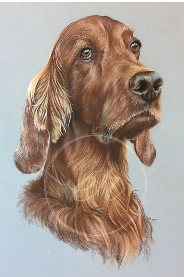
In this pet portrait of the lovely Conor, a Red Irish Setter, I made the simple but effective decision to draw him on a blue board. His orange and red fur contrasts really nicely against the light blue background. However, you can see that although the board is blue, it isn’t overly bright and loud, it is desaturated, (it has less colour), and this toned-down colour works very well with his coat which, after all, is not really red. He is, in fact, drawn in browns mainly, which are desaturated orange and reds.

‘Feeding Swallows’ is another simple yet effective example of using complementary colours to your advantage. I added in quite a lot of blue to their wings and backs, but, much like the pet portrait above, this is not overly bright. Here, I toned down the blue by also using greys in the wings and their backs, which not only made them darker and appear more rounded but also takes some of the punch out of the bright blue pencils.
I then also added in liberal amounts of pinks and oranges, which were mixed with the whites and greys, to give them a warm tint that contrasts the cooler blue. I could have drawn it true to the photograph and used hardly any blue and no prink to speak of. However, by making the decision to increase the colour and put the oranges and pinks next to the blues, I got a much more exciting painting which reflects the scene far better, too.
And breathe
So, there’s a fair bit more to colour than just plonking any old pencil onto the page, and this is just the tip of the mountain that is colour theory. The good news is, you don’t need to know it all, these few tools will help you to progress your work and also tie in very nicely with the next project to come out on this blog in two weeks time. Then, you’ll be able to have a play with colour theory on a real drawing, and that is always the best way to learn!
Thanks for reading and I hope you’ll join me in two weeks time for the next drawing tutorial xx
Stuck for where to begin?
Start with 4 free project outlines, ready to begin in pastel pencils straight away!
Keep your pastel pencil knowledge up to date!
Stay inspired and keep your pencil moving with inspiration and updates.
Don't worry, your information will not be shared.
We hate SPAM. We will never sell your information, for any reason.
