
Colour Temperature Made Easy in Art
Jun 05, 2024
This post is part of a full online art class for drawing Bluebells in pastel pencils. It’s perfect for beginners and as a fun weekend project – you could draw an entire carpet of them! In the lesson, we look at colour temperature and how it can help us make beautiful flowers.
There are plenty of classes to choose from, if you fancy taking on a new hobby then you can find loads of courses here.
What is a Hot or a Cold Colour?
Alright, so colours don’t really emit heat or reduce it, but they can have a feeling of being warmer or cooler. Perhaps it’s because glacial ice is blue; winters are generally soft and muted with those sparkling frosts and clear blue days – if we’re lucky. Whereas, summer is awash with colour and the heat of a fire is the brightest orange/red.
A great online reasource is Proko, he’s written about this too, you can find his brilliant blog here(read it here).
Eitherway, it does seem logical to have these warm and cool colours in art. These can be so useful to us as we go forwards and start to build more dimension into our work. They are also great to add more interest to seemingly simple subjects, like Bluebells.
Can We Have a Warm Cool Colour?
So, does that mean that only the yellows, oranges and reds are warm? While, the purples, blues and greens are only cool? Not exactly, remember that colour, tone and almost any other variable we use are all relative to their context.
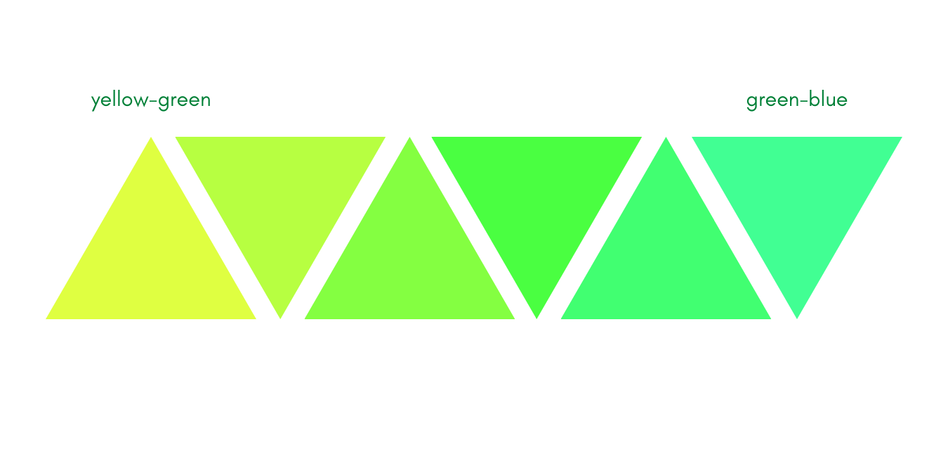
This means that as much as green has a cool colour temperature we can also have a warm green. If we put a yellow-green next to a blue-green, the bluer green will appear cooler. This is because yellow moves away from blue which anchors the cold half of the colour wheel. Meanwhile, green-blue has gone closer to blue and away from the warmer colour temperatures.
So There’s a Cold Red?
Yes! Indeed there is, providing you place that cold red next to a warmer colour temperature, it will appear cold. Red is next to both orange and violet on the colour wheel. A red-orange is about as warm as you can get, it’s like fire as Proko says!
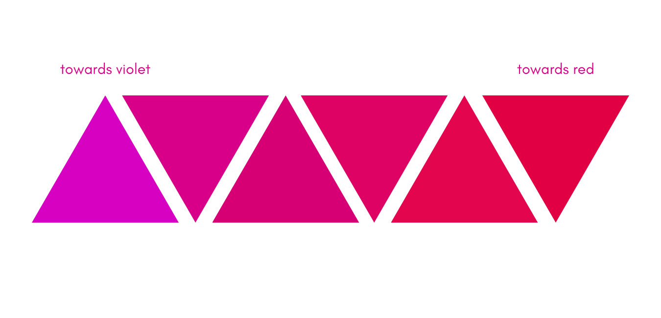
Whereas, a red-violet is tipping towards the other half of the colour wheel. The touch of violet begins to make our red cooler than the red-orange. And so, we have a warm red with the orange tint, a neutral red in the middle and a cold red with a hint of violet mixed in.
You can go on and on; a red with one part violet will not be as cold as a red with two or three parts violet. Let’s see that; the progression of red-violet from warmer to cooler:
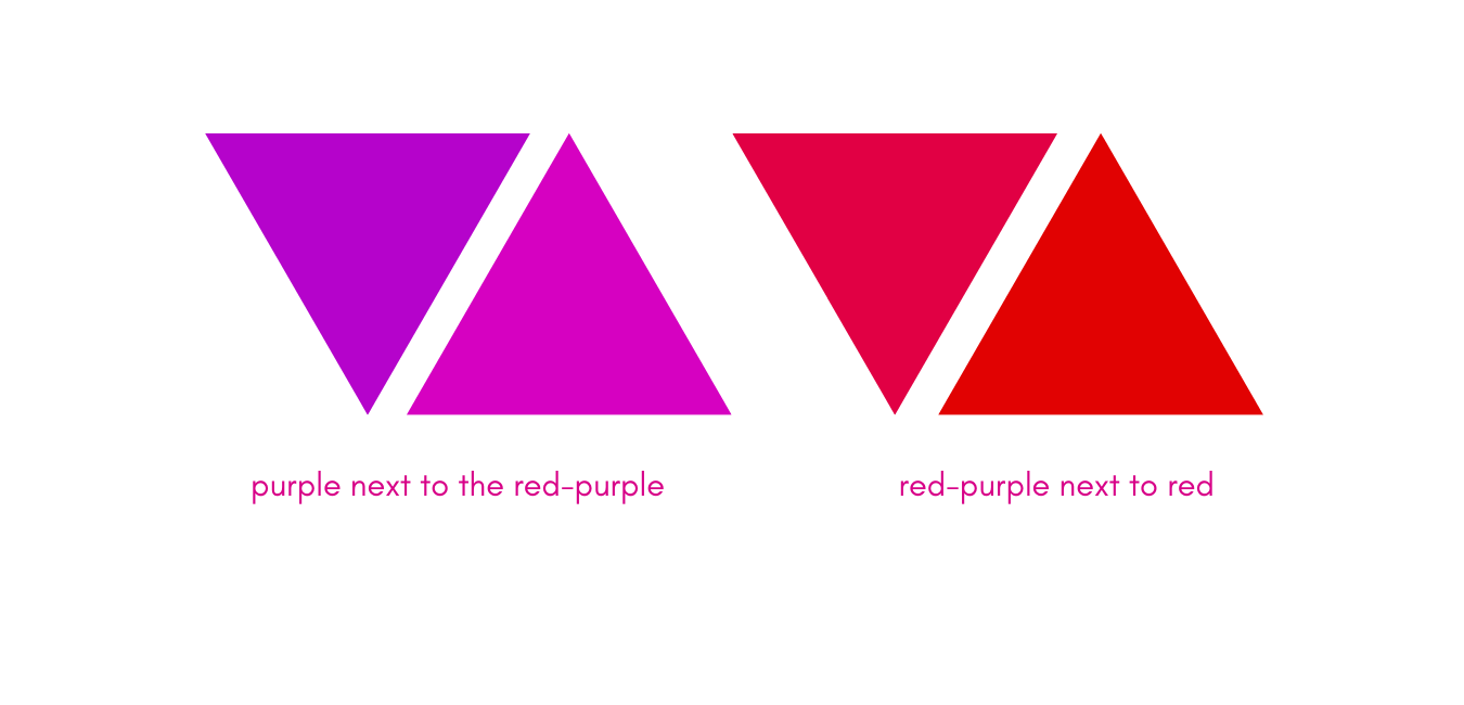
Don’t believe what you see? I promise neither end is fully purple or red, it’s amazing how our eyes can play tricks on us! See below the two end colours next to their ‘pure’ versions. This really shows us the variations available within a colour and how they can contrast each other.
How Can We Use Colour Temperature?
Getting my science hat on for a moment – the very briefest of moments! – these are useful to us for a few reasons. Firstly, cool colours receed, we can see this in nature very easily. Look out of your window and at the horizon, what can you see?
A blueish haze! So, things further away can often appear cooler or bluer in colour. In contrast, red doesn’t ‘travel’ very well at a distance. It is best to see warm colours up close and when we do they appear very vibrant.
So, this is a good little trick; the cooler colours, particularly blues and violets, work well in the distance. The warmer colours appear to jump out and towards us instead. You can use this to help focal points in your work come out towards the viewer.
Do We Always Need Cool Colours For The Shadows?
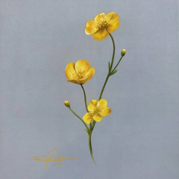
Not always, no, it is most important for a landscape, of course, but we aren’t talking about those. I usually use the cooler colours in the shadows but sometimes I like to reverse it. For a Buttercup, which is yellow, a warm orange-yellow works better at a darker tone than a cool lemon-yellow does. A lemon yellow would lose all of its colour and just be brown.
A yellow-orange, however, can go a bit darker and keep more of its colour so our flower isn’t brown. It’s a good idea to test out little swabs of your pencils to see which way round they’re going to work best.
Stuck for where to begin?
Start with 4 free project outlines, ready to begin in pastel pencils straight away!
Keep your pastel pencil knowledge up to date!
Stay inspired and keep your pencil moving with inspiration and updates.
Don't worry, your information will not be shared.
We hate SPAM. We will never sell your information, for any reason.
