
Desaturated Colour: A Quick Guide for Artists
Jun 05, 2024What is a desaturated colour? Why do we need desaturated colour in art?…
It’s fair to say that opening the big box of colour theory in art is scary. It’s a monster that appears to grow then become more and more confusing. However, this isn’t really the case; you just need to make a small start, like with desaturated colour, and begin to consider your own work. You can also find an introduction to general colour theory here.
Hence today, we are going to look at desaturated colour, or, you might know them as ‘muted’ colours, or, chromatic greys. They are generally the colours that aren’t too vibrant or offensive to look at, however, what does that really mean?
Download my free colour wheel workbook with 8 different color spinners to help you.
What does ‘Desaturated Colours’ Mean?
A desaturated colour means a pigment with another colour mixed into it, quite commonly white or black. These newly mixed colours will be closer to the greyscale and appear less vibrant than the original pigment.
In short, these colours can appear ‘muted’, ‘muddy’, or ‘soft’.
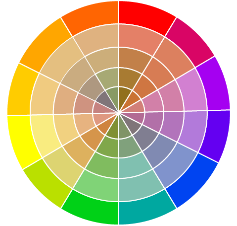
The colour wheel below shows saturated colours on the outside with gradually desaturating colours heading towards the middle. These colours have been made by mixing the opposite colour on the wheel (complementary) in gradually increasing amount, such as purple and yellow. Two opposites don't really agree with one another and create a 'non colour', or chromatic grey.
Why do Artists use Desaturated Colours?
Alright, so we have a simple definition of these colours and an idea of what they might look like. But why is this important for us? Well, I’m a British wildlife artist and if you think about it, a lot of wildlife here is very muted!
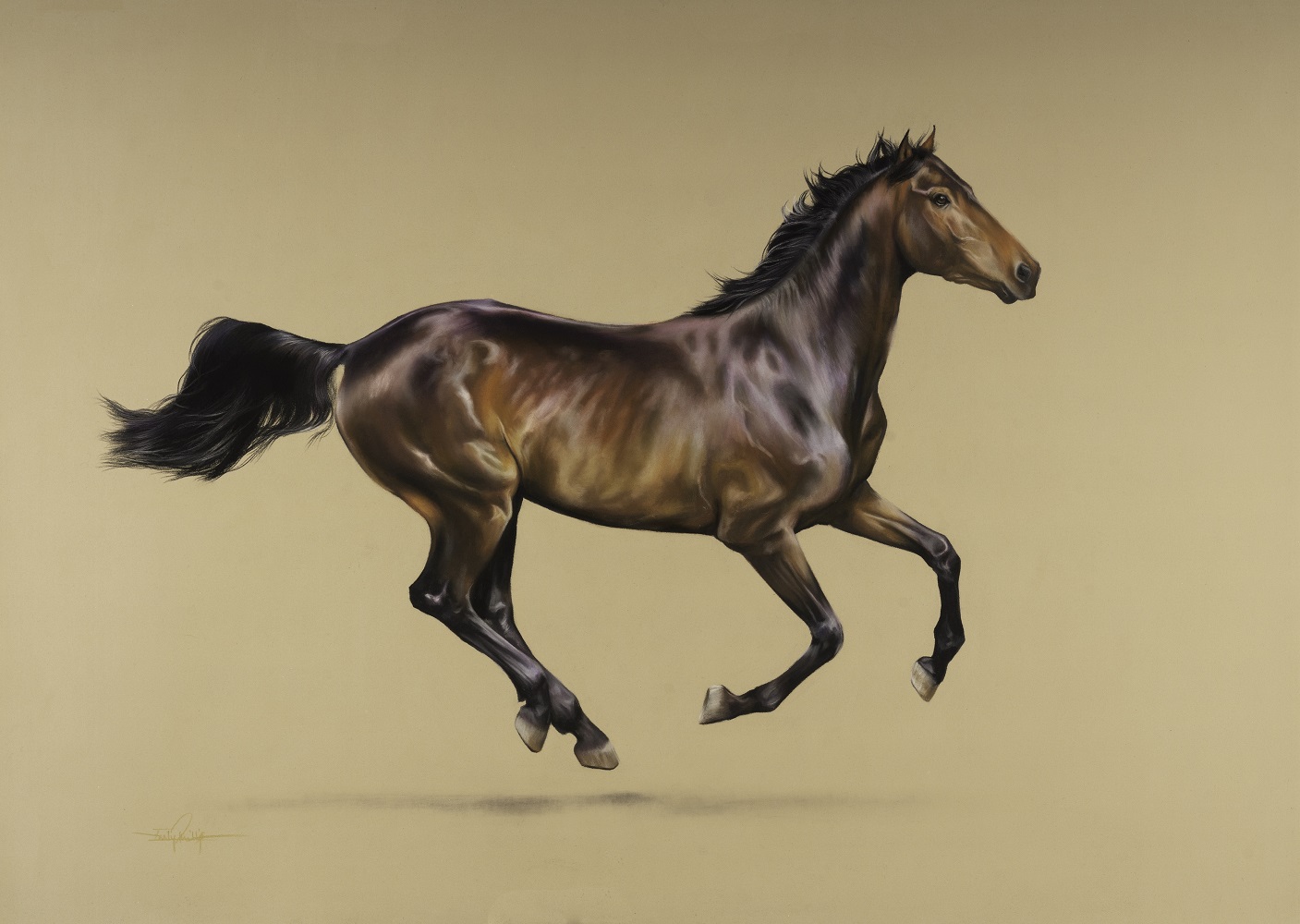
If you think about the animals here, you’ll realise there is a lot of brown, grey and white. It isn’t exactly the Caribbean with bright birds and crazy-looking fish. So, I use desaturated colours a lot because my subject matter is generally a mix of soft colours.
However, artists from all niches use these colours and you will have, too, without even realising it! Using desaturated colours helps to balance a picture; just imagine if your work was full of the brightest greens, yellows, reds and so on. The entire piece would be ‘loud’ and bold but you wouldn’t have much order to the work.
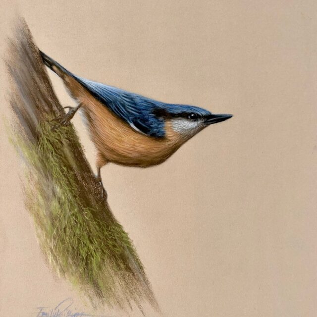
If we go and use these quieter colours along with some brighter pigments as well, then the brighter areas become a focal point, (the blue and green in the picture above look quite bright next to all the browns). The desaturated colours around the bright pigments help to balance and support it; instead of the whole painting being loud and shouty, we have a little crescendo up to it.
It is far easier to hear what someone is saying if nobody else is talking over them, and that is a good way to think about too many bright colours. The desaturated colours are happy to be quiet and listen to the brighter areas.
How can I make a Desaturated Colour?
Alright, you have an idea of what they are and want to know how you can make one now! Well, with pastel pencils, you can’t simply make yourself a new pencil, but not to worry. They provide lots of desaturated colours ready to use, and, you can also glaze pencils to create a new colour.
I often use a grey to lightly glaze over the top of a too-bright area to help reduce the amount of colour. Equally, you could use a lighter grey or even white to do this. You can also mix one colour over the top of the other to reduce the vibrancy!
If you were to put some red down and it was too much, then you could glaze over in yellow. This wouldn’t make a very grey colour, however, it would make that red more orange. Because there is less of the original red, we have desaturated the original colour and reduced the intensity of the red.
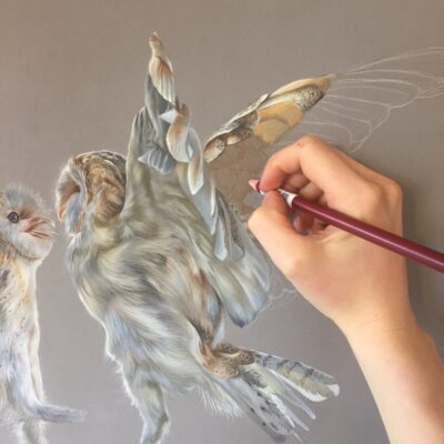
You can have a proper play with this and see how one pencil layered over another creates brand new effects. I do this all of the time, if we look at the owl photo below, you can see a total myriad of muted colours.
These colours were made by laying down a lot of soft light grey or gentle browns and then glazing some colours over this and visa-versa. I was already using some muted yellow and orange colours to glaze with anyway, but the added layers of grey and brown really helped to mute the colour.
Stuck for where to begin?
Start with 4 free project outlines, ready to begin in pastel pencils straight away!
Keep your pastel pencil knowledge up to date!
Stay inspired and keep your pencil moving with inspiration and updates.
Don't worry, your information will not be shared.
We hate SPAM. We will never sell your information, for any reason.
