
Botanical Drawing Class in Pastels: An Opulent Purple Poppy
Jun 05, 2024
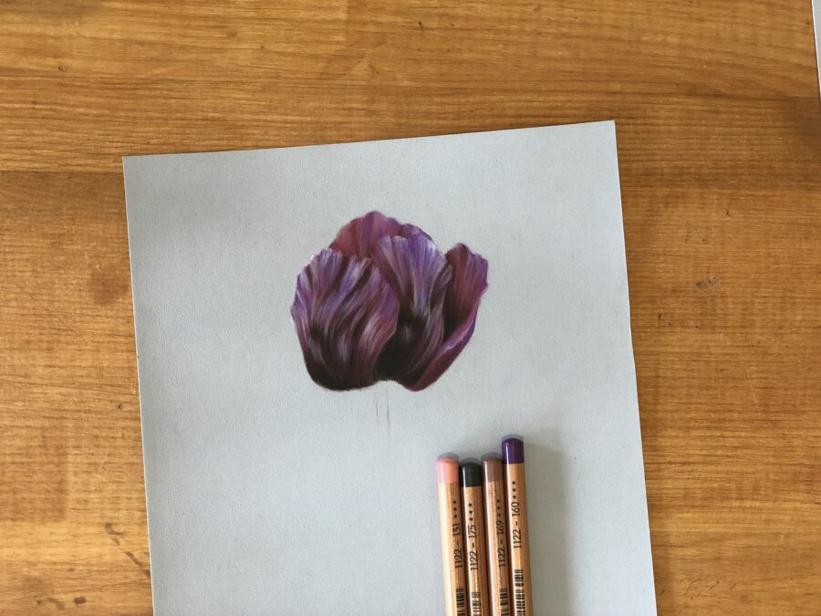
Materials
As I have already said, you can get a big discount on these pencils over at PaperStory, just follow the links. As always, I don’t make a commission on any links here, these are just my favourite materials to use and where I like to buy them from.
Faber Castell Pitt Pastel Pencils:
Click here for the official pencil pack with 27% off!
Manganese Violet -160
Dark Sepia – 175
Burnt Carmine – 193
Indian Red – 192
Caput Mortuum – 169
Light Ultramarine – 140
Cold Grey I – 230
Medium Flesh – 131
May Green – 170
Earth Green – 172
Clairfontaine Pastelmat Paper – Light Blue
Clairfontaine Crystal Paper, (the pads of pastelmat, come with this already in between the sheets).]
Step One
To begin with, we are going to need a reference photo and then an outline. I source my own reference photos from photographers I know, online collections from which you can buy the rights to the photos or photos which are online for anyone to use. To avoid copyright issues, I don’t share my photos on this blog, however, you could source a photo similar to my finished drawing, of which there are many, or copy my drawing as I go.
To get an outline for your poppy, you can either trace your reference or freehand draw it onto your pastel mat. If you are new to drawing, I would advise transferring the image, it will help you. You can find the different ways of doing this on my previous blog here.
I used the 160 to lightly sketch out the outline of my Poppy, I tend to use teachings from the Bargue method, (see aforementioned blog), and look to angles and straight lines which gives me a greater accuracy than curves.
When you have sketched out your poppy and are ready to begin, take the 175, sepia dark, and shade in the darkest shadows on the flower. These are likely to be near the base of the flower, which is also where the petals are dark in colour, as the petals are not catching the sun. Already at this early stage, you should try to think about the direction of your pencil marks, these should flow with the lines on the petals which fan out and up from the base where the petals are joined to the stem.
When you are happy with the placement of your shadow, colour it in with another layer of the 175 to make it darker and gently fuss the edges to keep them soft, gradually grading out so that we can work into them later on with ease.
Lastly, use the 160, manganese purple, to shade in the rest of the petals. This is going to give you a very flat ‘map’ of the flower; the darkest areas and the midtones. Do not worry about the brighter areas, we will be drawing these over the top of the 160 later on. If you like, you can outline the edges of the petals in the light grey, 230, so that you don’t lose your outline as you go.
Step Two
The lovely thing about drawing using this method, whereby we block everything in early, is that the blank page doesn’t come back to haunt you later on; we have filled in all of the space which we are going to draw on and the fear of making a mess vanishes!
Next, we are going to mark out some more structural areas by using a pink/purple, the 193 – make sure you pick up the 193 and not the 192 which we will be using in a bit. As I explain in the video, using just one brand of pencils can limit your palette a little, (it makes it easier for the purpose of a tutorial though). There aren’t that many purples to choose from in the Faber Castell range, and so, we have to get a little inventive. What we are going to do, is use some basic colour theory to help us; we will make our shadows warmer in colour and more pink, (as there are quite a few dark pink pencils) and the highlights are going to be cooler and bluer, (you guessed it, there are a few light blue pencils, too). Both pink and blue are on opposite sides of purple, on a modern colour wheel, and so they will work nicely together for this drawing.
If you had an orange poppy, like a lovely Welsh poppy, for example, you could do the same thing there and make the shadows red and the highlights more yellow. You can find colours wheels online in case you can’t remember which colours are neighbours.
Right back to the drawing… as I was saying before I rambled off, we are using the 193 to add in some more shadows. On my reference photo, there are plenty of folds and ‘waves’ in the petals, they are almost like silk, and so we want to add these softer shadows in with a pencil lighter than the 175. Mark out your shadows with the 193 and colour them in. This will mean colouring over both the 160 and some of the 175 which is already down. It will look quite pink but don’t panic!
Next, take the 192, which is a little darker, and mix this into the areas where the 193, (previous pencil we were using), meets the 175. This should start to join these two colours together a little more. You want to keep thinking about those directional lines on the petal which are flowing upwards and certainly not straight!
Your colours will still be looking a bit off, and you may now also need to add in some more 175 if you haven’t pressed hard enough the first time. If you can see the paper through the pastel, take the 175, sepia dark, and go back over those areas again. Make sure you leave soft edges by lifting the pencil off of the page whilst it is still moving, in a sweeping motion.
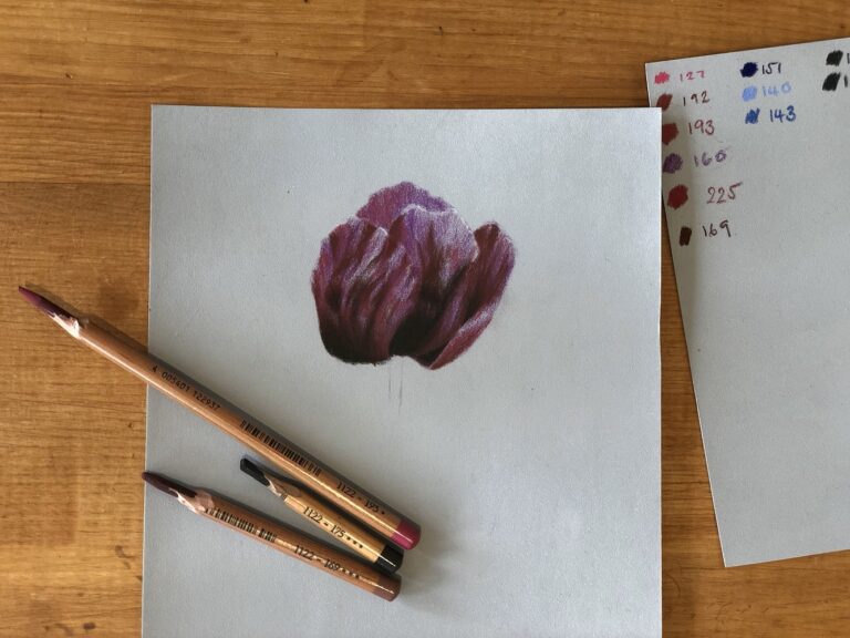
Finally, we can unify the drawing by introducing the 169, caput mortuum, which is a very dark purple/red colour. You can use this to glaze, (that is shade very lightly), over some of the 175 and then move to the areas of pinky purples and press quite hard to darken them a little and unify the 175 with the purple colours.
At this stage, it will have a lot more structure, but still be looking quite messy.
Step Three A
Now that we have spent some time getting those darker areas right, we can turn our attention to the highlights, which as you may recall, are going to be cool in colour and head towards blue. So, unsurprisingly, we will be starting with the 140, light ultramarine.
Once again, I would like you to think about how you are applying this layer, I remember once my violin teacher telling me it didn’t matter so much what I did in the middle of each bow, it was important that the start and finish of each bow, (or note), was right. Now, of course, it does matter a little what you do in the middle, but ultimately she was right; make sure the start and finish are neat and tidy and you forget what happens in between. So, on that note, I’d like you to think about those soft edges, smokey edges, or to be fancy sfumato, (this is an old painting technique for oils, whereby, edges are soft and smokey which allows each colour and tone to almost seamlessly flow into the next. Think Leonardo).
Use the flat of the pencil to apply some 140, light blue, to those cool highlights on your poppy. You may find some highlights are dramatically ‘sandwiched’ in-between two deep shadows. Make sure the direction of your pencil goes with the rest of the poppy petal, every layer should flow with the previous one, not crosshatching here, please!
Step Three B
To unify the petals, take the 160, purple, again and go over some of the blue, (as needed, you do want the blue to show but you may need to soften edges and tone some of it down if you pressed too hard). You can also use the 160 to press hard and darken some shadows, or the edges of them. Overall, you want to use this pencil to unify and tidy up the petal.
While you’re here, sharpen up the 160 and address the edges of the petal which are slightly ruffled. We want these to be neat, but they don’t have to be sharp edges, not all over. You may find it nice to have the petals closer to us in focus but then run the putty rubber along the back petal edges and soften them, like a photo.
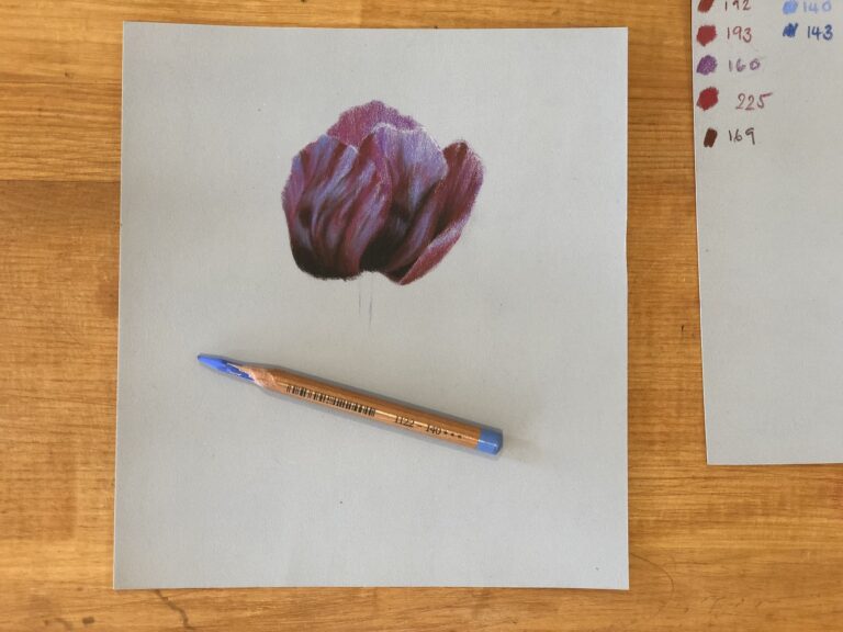
You might find that your poppy looks a little flat still, but remember, we have yet to add the highlights which will change it. However, I decided to strengthen up some areas and went back over with the; 175, sepia dark; 169, caput mortuum and putty rubber. Try to have all of the paper under the shadows covered and you’ll end up with something similar to the photo below:
Step 4
Now that the poppy is looking very much more solid and real, we can work into the highlights. So far, we have developed the midtones and the shadows but it still looks a little flat and so we are going to extend the range in the values. Now, we take the cool light grey, the 230.
You want this pencil to be fairly sharp, as, unlike the blue we were using, this layer of the highlights holds some detail and more finesse. We still want to keep soft beginnings and endings to the lines; brushing the pencil on and off the page whilst it’s moving, however, we no longer want to glaze. Instead, we are looking to add many fine, flowing lines which are the small ridges on the petals which are catching the sun. If we were to shade the highlights as one big block, it would look very heavy but also tell us that the petal is entirely smooth, which is not true.
To make sure you avoid a big block of shading, use the pencil on the fine tip and try to allow gaps of the colours beneath to show between the cool grey. I also vary my pressure a little as I work so that some lines are a little heavier and others finer; it adds to the organic nature of the drawing. Another tip would be to turn your pencil between strokes as this heavy to keep the tip pointed and sharp.
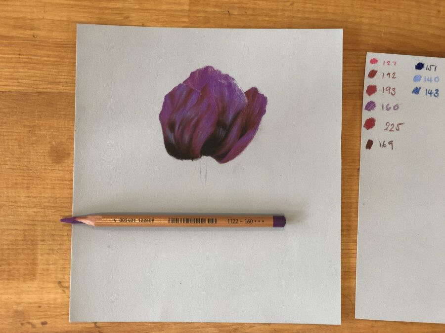
You may need to add a little more blue as you work, judge it as you go. This should take a little while to complete and you want to be sure of the direction of each line before you begin so that they are all flowing together. You should have something like the photo below:
Step 5
You can see that step 4 really changed the flower, it has gone from flat and a little messy, to something delicate and beautiful. I think it pays to hold back and get the first stage right, although adding the highlights can be fun and bring it all together if you add them too early to miss the chance to make you midtones and shows dark enough.
This next step isn’t totally necessary but is it a lovely addition to your drawing and you get to use that beautiful pink, too. So, start with the pink, 131, and make sure it is fairly sharp as we are using it like a pen and not on the flat of the pencil. You don’t need to add lots of this to your drawing but I added some shorter lines, (like those we were drawing in the previous step with the light grey), where the purple meets the light grey. This works as a nice segway from one tone into the next and the warm pink contrasts nicely against the cool blue highlights. Less is more, don’t overdo it!
At this point, I also returned to the 175, sepia dark, and the 169, caput mortuum, as some of my shadows needed touching up and I also make one or two slightly bigger than they were in the photo as I felt it worked much better in the drawing. That is something to keep in mind whenever you are drawing: your photo is a reference but not a shackle, you can change what you put into your art, make it your own.
Another thing to mention here is that we have made out highlights and midtones very detailed, there is a lot going on with the blues, pinks, many flowing lines and purple-pink midtones. It’s beautiful, but, have we forgotten the shadows? Well, yes, but on purpose. If we are making our highlights very detailed, then we should reduce the ‘noise’ in the shadows and this will balance out the painting, preventing it from being over the top and confusing. You may think that such a ‘rule’ doesn’t make sense, but just take a look at almost any Caravaggio, he did it so why can’t we?
Step Six
The last step, I feel as though we have rocketed through this, then again, one previous tutorial was how to draw a Peacock…definitely a whole-weekend type of project! The last part to add, unsurprisingly, is the stem. It’s a quick and easy little step which is best made less of. I think some important things to remember when you are finishing off a study like this, is that the star of the show is the poppy, without question. So it follows, that the stem should be ‘quiet’ by comparison, support the flower but be gentle and uninteresting, keep that in mind.
Start with the 175, sepia dark, as on my photo the very top of the stem was in deep shadow. This also keeps in with what I just said; we can merge together the top of the stem and the bottom of the flower seamlessly. Imagine if the bottom of the poppy, which is so dark, suddenly met a bright green stem, it would draw attention, wouldn’t it?
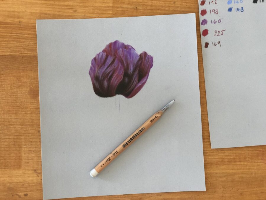
Talking of bright green…take the zesty 170, may green, and use this to draw in the stem, by this I mean from the 175 we have just put in right to where you want it to end. You may find it useful to have a look at my finished study below. You can see that I have trailed the green off into nothingness. I would encourage you all to do the same and have the stem fading out, it draws less attention.
Over this bright green, we are going to mix 172, earth green, which is bluer, (as most poppy stems are) and also less vibrant. This will tone the stem down but the brighter green underneath gives it a bit more life than the 172 by itself. You should have a soft green stem in front of you, make sure you have mixed the greens into the edges of the shadow so that it is soft.
Lastly, use the 230 to add some hairs to the stem, if you’d like. Instead of drawing in each hair, I chose to very lightly trail the light grey along the stem and give it a sort of ‘halo’ which gives the effect of small hairs catching the light.
You should now have a finished poppy study, isn’t it beautiful?
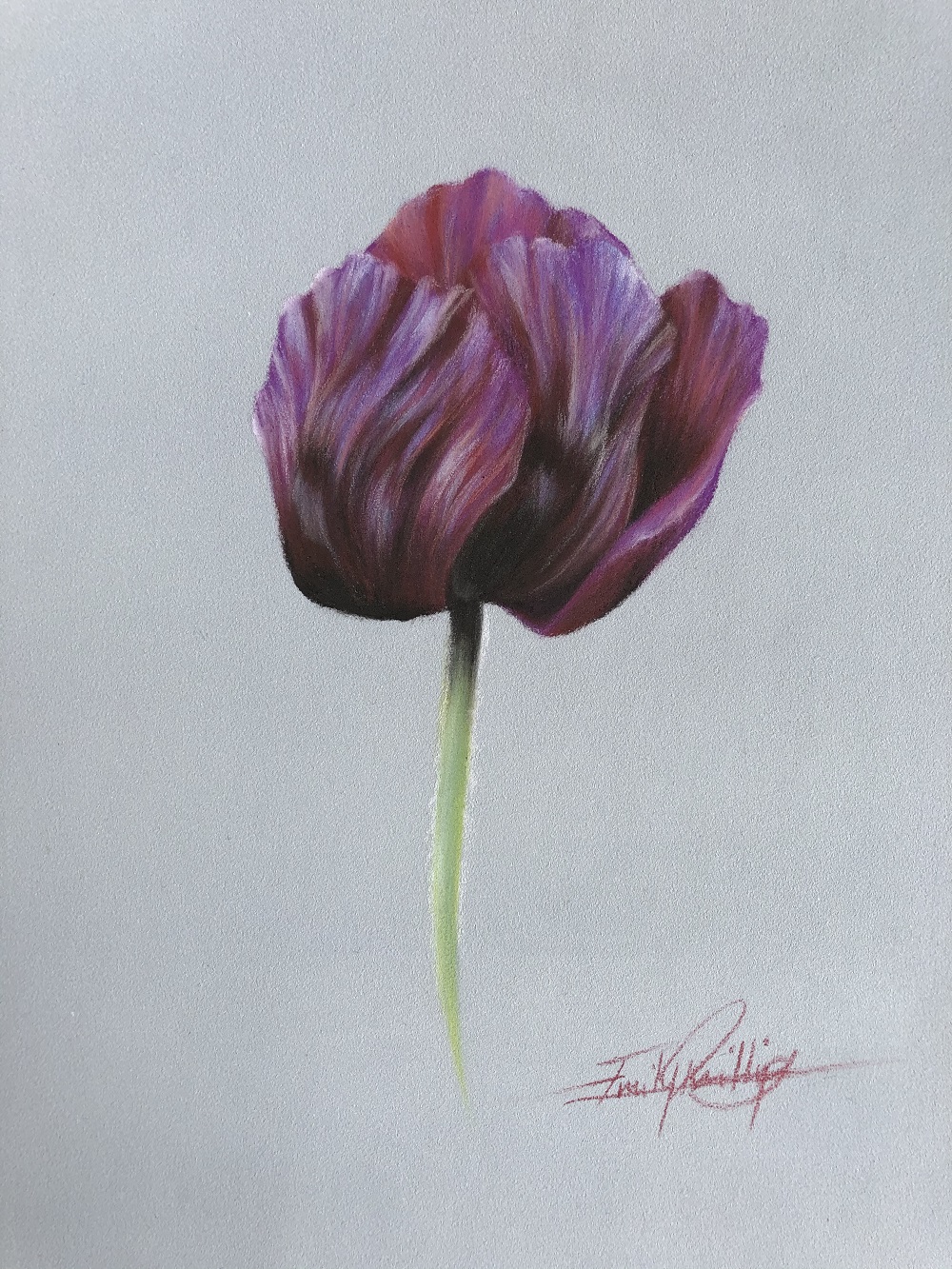
I hope you have enjoyed this tutorial, the finished study is really something with those rich darks and delicate highlights. If you could, I would really appreciate your support of this blog, please share it on social, tell your friends or give me a review on Google.
Stuck for where to begin?
Start with 4 free project outlines, ready to begin in pastel pencils straight away!
Keep your pastel pencil knowledge up to date!
Stay inspired and keep your pencil moving with inspiration and updates.
Don't worry, your information will not be shared.
We hate SPAM. We will never sell your information, for any reason.
