
How to Draw a Sunshine Yellow Buttercup
Jun 05, 2024
Welcome back to those of you who follow this blog and to newcomers, welcome to the ramblings of me, Emily Rose. This week, we begin the project of drawing a meadow, I get a lot of requests for drawing flowers and I’m not surprised; they’re bright, cheerful and make lovely additions to your walls!
In the last post, I went through some basic composition theory and how you can use it to your advantage, creating more interesting and captivating work, missed the post? Find it here. The idea really, was so that you can compose your own flower scene over the coming weeks with this mini-series which is going to focus on one flower at a time. If you have a request for a favourite flower, send it my way and I’ll see if I can include it in the list.
As there will be several of these little studies appearing over the coming weeks, I am releasing each one on my website, unframed and available here.
As is becoming a theme of this blog, a video also accompanies this post and you can find it below along with the written instructions. The lovely Angie who runs Paper Story, my pastel pencil suppliers, are once again offering you all a massive discount on Ready to get drawing? Let’s begin!
Materials List
As always, I don’t make a commission on any links here, these are just my favourite materials to use and where I like to buy them from. A big thank you to Paper Story who are providing the pencils for my tutorials with up to 30% off which is an amazing saving for you all and makes getting the right colours super easy, too!
Get the pencil pack with 27% off here
Find individual Pitt Pastell Pencils here
Faber Castell Pitt Pastel – 102 Cream
Faber Castell Pitt Pastel – 103 Ivory
Faber Castell Pitt Pastel – 106 Light Chrome Yellow
Faber Castell Pitt Pastel – 168 Earth Green Yellowish
Faber Castell Pitt Pastel – 173 Olive Green Yellowish
Faber Castell Pitt Pastel – 180 Raw Umber
Faber Castell Pitt Pastel – 182 Brown Ochre
Faber Castell Pitt Pastel – 183 Light Yellow Ochre
Faber Castell Pitt Pastel – 184 Dark Naples Ochre
Faber Castell Pitt Pastel – 185 Naples Yellow
Faber Castell Pitt Pastel – 273 Warm Grey
Clairefontaine Pastelmat – Light Blue
Faber Castell Putty Rubber
Crysta Paper (if you buy a pad of paper it will come ready with your pastelmat).
Find the full video tutorial below, you’ll also find other video tutorials on my youtube channel.
https://www.youtube.com/embed/scjnu4CWL4E?autoplay=0&mute=0&controls=1&origin=https%3A%2F%2Femilyrphillips96.wixsite.com&playsinline=1&showinfo=0&rel=0&iv_load_policy=3&modestbranding=1&enablejsapi=1&widgetid=1
Step One
Ok, so your pencils are sharp, (right?), and you’re itching to start; it’ up to you how you’d like to begin this one. As you can see on the video tutorial, I drew the flowers straight onto the board free hand by using the 184, Dark Naples Yellow. If you would prefer, though, you can transfer a drawing or trace instead but make sure you don’t press too hard with the transfer lines! Find a tutorial for transferring images here.
To begin, take the 185, Naples Yellow, and colour in every petal fully. This is giving us a base to work with, it’s a block of general yellow to work from. By general, I mean that it is the local colour of the flower but tonally, (darks and lights), it is in the middle which works great for us. From this point we can manipulate the lights and darks whilst this midtone yellow holds the flower together.
Speaking of holding it together, make sure you haven’t got a grainy covering here, you want to ensure that the blue of the paper is totally gone and you have yellow dust lose on the top, (blow it off). If you have some yellow dust then you have put enough pastel onto the flower.
Next, take the 183, Light Yellow Ochre, and we are going to use this to mark out the darks on the flower. This colour is for all of those areas which are in shadow and not catching the light, so make sure you are confident as to where your light source is coming from before you begin.
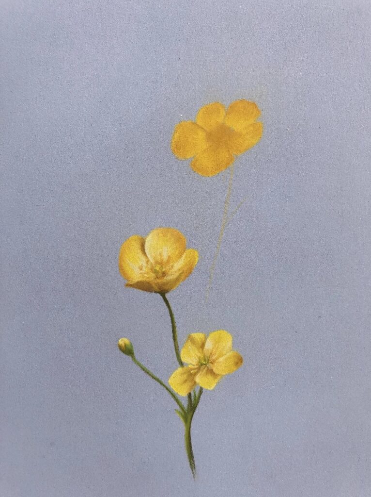
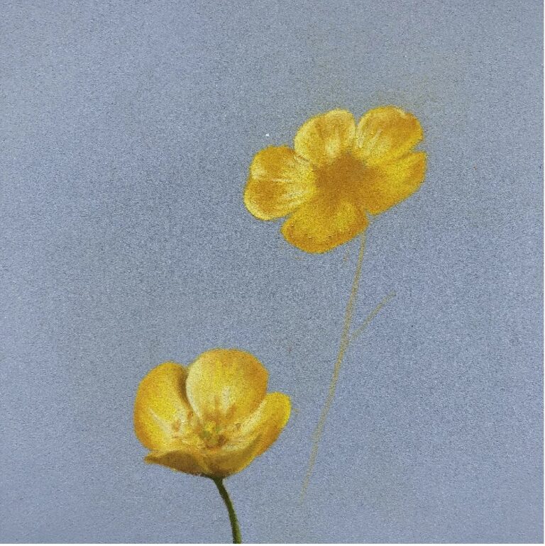
You should end up with something similar to that below, (we are looking of course at the top Buttercup). You can see that it is basic and almost like a reductive map of the flower; there’s enough pastel to see what’s what but nothing has been elaborated on – yet.
Step Two
So, with our basic ‘roadmap’ in place, we can start to add the more refined details of the flower. Being such a small study, (this is slightly larger than life-sized), we can’t afford to over saturate the space with lots of different colours and need to be precise with those we use.
Next, we are going to take the buttercup lighter with the 106, Light Chrome Yellow, which will make the 182 appear darker by comparison and give more dimension to the flower. To decide where to apply this pencil, study your reference photo to see where is reflecting the sunlight. Instead of absorbing the sun and appearing to just be lit, the Buttercup is a reflective surface and so instead we get shiny petals as the light bounces right off them. You’ll notice that this often yields very sharp edges on the lit areas of the flower and so make sure your pencil is sharp to give you a clean edge.
You will need to press quite hard to have this layer show up properly as we have already laid down quite a lot of pastel. Also, remember, your individual petals have small waves running through them and fanning out. You can to colour in the direction of these lines and not against them, just like you would colour fur in the direction is lays.
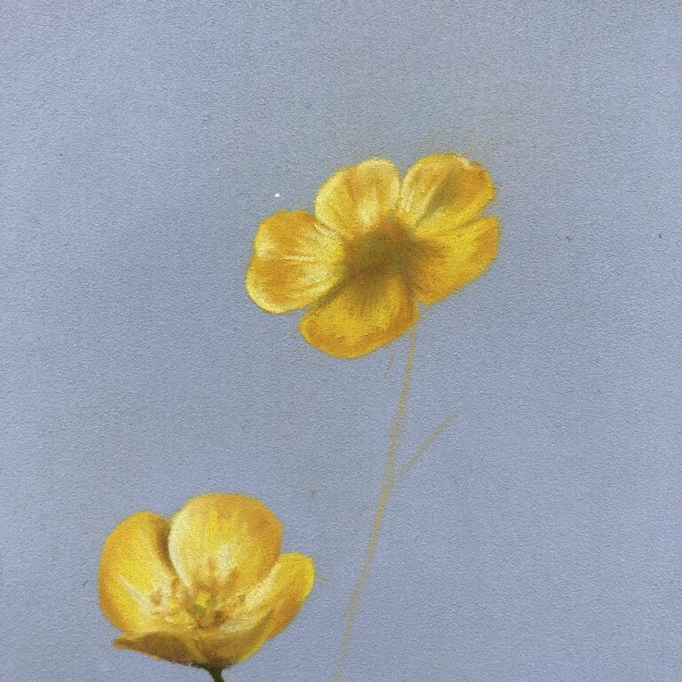
After you are happy with the application of the 106, we are going to make some areas lighter still with the 102, Cream, which is reserved for only the brightest areas. On my photo, I found this was required on the edges of some petals, (again, a sharp pencil is essential), and in the middle of some larger areas of the 106. Study your photo though, and remember, ask yourself ‘where is the sun coming from?’ It should keep your drawing plausible, especially if you are drawing multiple Buttercups.
Step Three
The satisfaction of drawing such delicate flowers is that they tend to appear on the page quite quickly, (although I am terrible for tinkering about for ages!). Logically, as we have just seen to the lightest areas, we are now going to turn our attention to the shadows and really make the brighter yellows pop out.
To start with, take the 273, Warm Grey, and use this to shade the darkest areas only. In my drawing, I used the grey to shade the centre of the flower in and a small shadow between two petals. You can see on the other two Buttercups already drawn, that you can also get these very dark areas on the other side of the petals if they are visible. You don’t need to press too hard with the grey, it should have an effect quite easily so go carefully with this one.
Next in line, is the 168, Earth Green Yellowish, which I used to glaze over the top of the grey for the centre of the flower. By glaze, I meant to very lightly apply with pencils so that it doesn’t obscure the pastel beneath it, rather, tinge the other layers green. A good way to do this is by using the flay side of the pencil, however, this is a very small space and it might be easier still to instead use the pencil blunted.
To finish this step off, and harmonise the grey with the yellow, pick up the 182, Brown Ochre, and gently go over the grey and green. This will reduce the intensity of the green but also create a great segway from grey to yellow. The 182 is an orange-yellow and orange plus green gives you a muddy grey colour. By glazing the 182 over the green and the grey, we get ‘colourful’ greys, or chromatic greys, and this will harmonise the shadows with the rest of the painting, bringing it all together. It will also keep our shadows warm and so make our highlights, which are a cooler yellow, that much more impressive.
Step Four
Now we are really making progress as the base of our flower is totally ready for the last layers. So far, we have built up the structure with layers of light and dark plus cool and warm, to give us a convincing shape and form of a Buttercup. Now, we can add a little more dimension and some texture with the stamen of the flower. For these, we will use a few different pencils and not get bogged down into the details of how many stamens there are, how they criss-cross each other and so on. Instead, we will be suggesting what is happening with some well places marks which will appear quite convincing over this dark base we have made.
To start with, take the bright 184, Dark Naples Ochre, and use this to draw in a few curved lines and some dots on top of them. The lines, should originate from the base of the flower and curve in a ‘C’ shape out and them back inwards. Depending upon the view of the Buttercup, you may be able to see this quite clearly, or, if your view is looking down onto the flower, you may not see the stem of the stamen at all and instead simply have a selection of dots and dashes, like the other Buttercup which I have drawn.
Once you have added a few marks, (note few, you need to allow some of that lovely dark shadow to be present to contrast these lighter marks and give depth), take the 106, Light Chrome Yellow, and add a few more marks to the head of the flower. As this is a much lighter pencil, make sure it is sharp for accuracy and draw fewer highlights. We want to become progressively more selective as we go up in range, so, even if you think ‘wow, this looks great’, just as a few dots in and come back later to see if you need more.
To contrast the lights, I had a couple of stamens which were silhouetted by the sun and I drew just a few of these in the 182 which you can as well, should you need to.
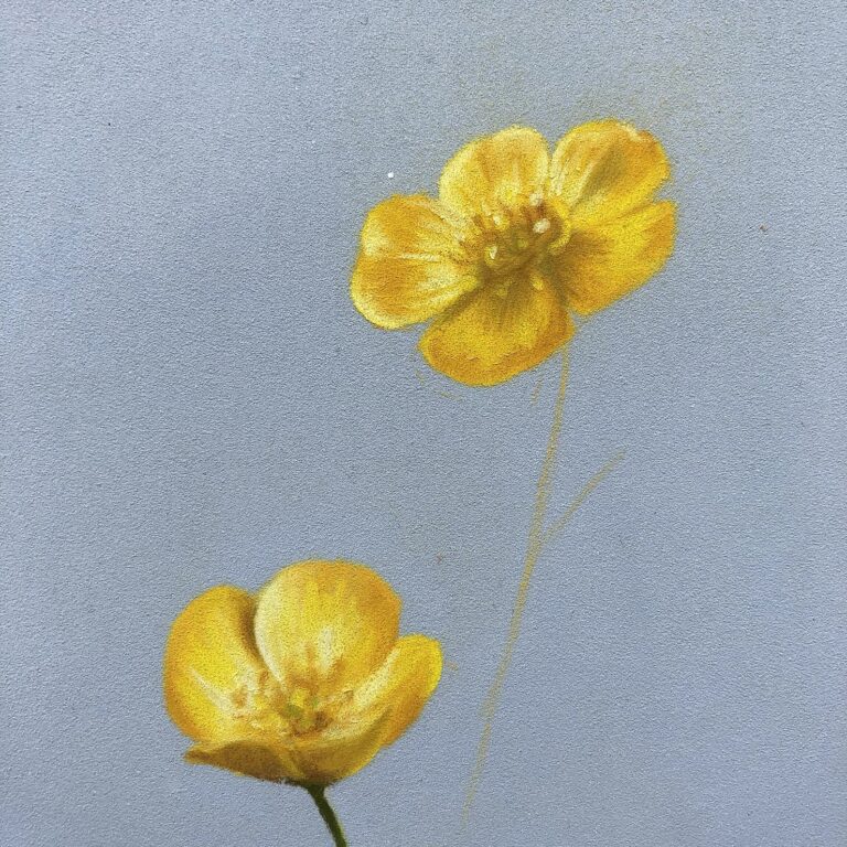
To finish, take the 102, Cream, and add in those very brightest parts of the head of the flower. It is also a good moment to return to the other bright areas and touch them up as needed. You should now have something similar to the photo below, you can see that much of this is suggested and the tones of the pencils have played a far greater role in the structure of the flower than accurate, tiny marks.
Step Five
Believe it or not, this is the last step. This is only a short tutorial but you could draw yourself several flowers with it – and add to the drawing in a couple of weeks with the next flower tutorial I release!
Unsurprisingly, to finish we are going to add in the stem of the flower, which requires the last ounce of patience and care. A good point to take a quick break if you need it!
You can see that I marked out my stem with the 184, right at the beginning. Well, as the drawing progressed I actually changed my mind on the angle of the stem and erased the mark. That’s the beauty of using the pencil lightly; I could totally remove the mark and redraw the stem.
To begin, sharpen up your 173, Olive Green Yellowish, (don’t these pencil names just run off the tongue?…), and carefully draw in the line of your stem. If you are happy with it, redraw the stem until it is a thick as you want it to be – this is a good reason to star with the pencil very sharp, it gives you much greater control of the width.
Over the top of this line, take the 168, Earth Green Yellowish, and on the side which is catching the sun, trail a soft line of the light green over the top of the dark green. This means it will now be catching the light but you won’t have made the stem any thicker. I tend to trail it on and off, instead of in a thick line, as it appears more delicate and convincing.
You may notice that there is a small amount of reflection on the stem from those shiny bright yellow petals. I have added a little yellow reflection onto the top of the stem with the 184, Dark Naples Yellow, close to where the petals are. This has really brought the drawing together, the stem and flower become properly joined. It is often small details like this which really push your art to another level and bring life to the work.
We are almost finished now, just a couple of tiny tweaks to go. Firstly, if you think those core shadows need to be a little darker still, you can use the 180, Raw Umber, to do this. I reinforced my shadow from the stamen with the 180 and it gave it much more solidity but you may or may not need to add this in.
Lastly, go back and retouch any highlights which have dulled over the course of the drawing. This can often happen as pastel dust floats about and the settles down on top of your ivory and white. I used the 103, Ivory, to retouch highlights on the petals.
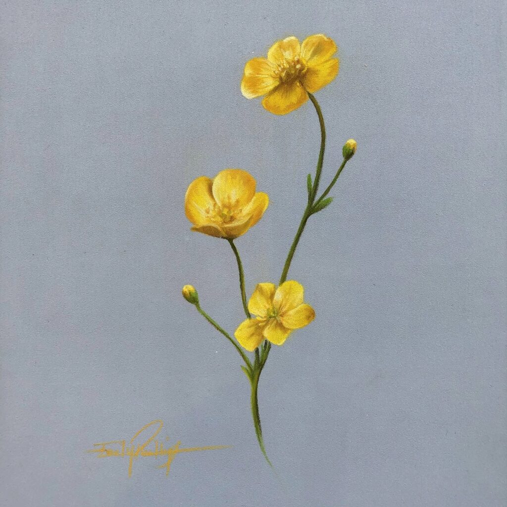
You should now be the proud creator of a beautiful little Buttercup! I really hope you have enjoyed this tutorial, I can’t wait to release the next in this series of British meadow flowers and should you have a request for one, send it my way.
As I mentioned at the beginning, this little Buttercup study is now available on my website, as will the other flower studies produced in this mini-series.
Stuck for where to begin?
Start with 4 free project outlines, ready to begin in pastel pencils straight away!
Keep your pastel pencil knowledge up to date!
Stay inspired and keep your pencil moving with inspiration and updates.
Don't worry, your information will not be shared.
We hate SPAM. We will never sell your information, for any reason.
