
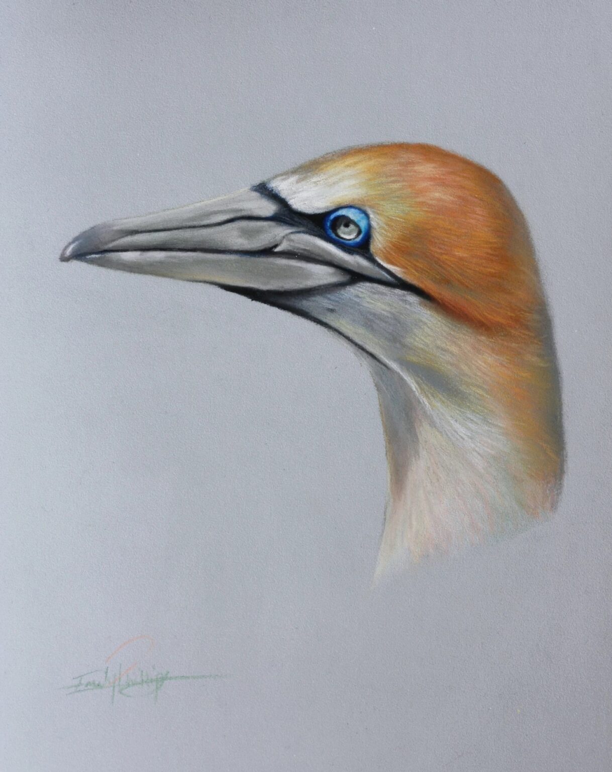
Let’s Draw a Gannet in Green and Pink
Jun 05, 2024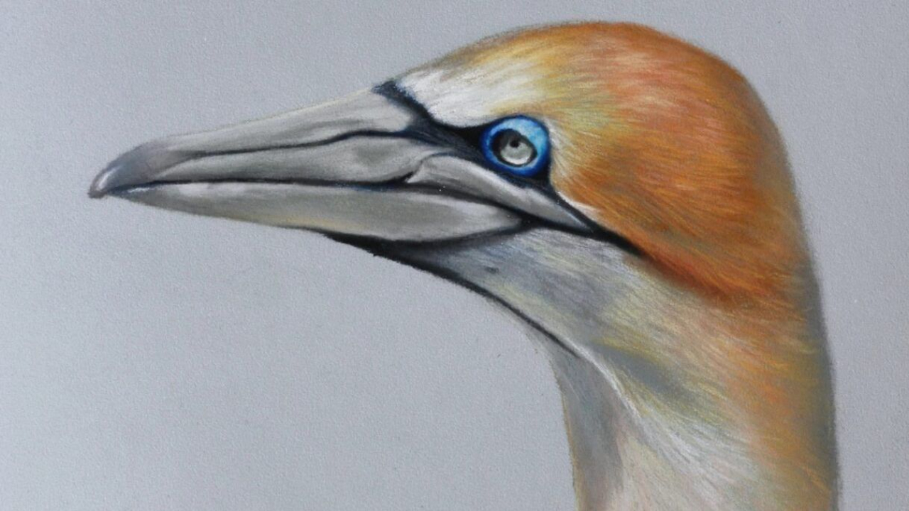
Gannet in pink and green? I hear you ask. Well, sort of, yes. This week we are following on from the previous post which was concerning basic complementary colour theory and we will put some of that theory into use. A Gannet is an ideal muse for this project as they have a stunning blue eye with orange-gold plumage, and if you were paying attention two weeks ago, you’ll know that they are complementary colours.
We will be adding in quite a few ‘secret’ colours to this drawing but if you are using just pencils which you have to hand, make use of what you have and see where the colours take you. We learn most when we take a plunge and experiment so don’t worry if yours is different to mine; you may learn something new!
Materials List
Just to reiterate, I don’t make a commission on any of these links and nor am I sponsored by the products used, this is just my usual set up and where I like to buy my materials from.
Buy the pencils here with 30% off
Faber Castell Pitt Pastel – 172 Earth Green
Faber Castell Pitt Pastel – 160 Manganese Violet
Faber Castell Pitt Pastel – 181 Payne’s Grey
Faber Castell Pitt Pastel – 199 Black
Faber Castell Pitt Pastel – 273 Warm Grey IV
Faber Castell Pitt Pastel – 230 Cold Grey I
Faber Castell Pitt Pastel – 270 Warm Grey I
Faber Castell Pitt Pastel – 151 Helioblue Reddish
Faber Castell Pitt Pastel – 140 Light Ultramarine
Faber Castell Pitt Pastel – 156 Cobalt Green
Faber Castell Pitt Pastel – 187 Burnt Ochre
Faber Castell Pitt Pastel – 169 Caput Mortuum
Faber Castell Pitt Pastel – 182 Brown Ochre
Faber Castell Pitt Pastel – 186 Terracotta
Faber Castell Pitt Pastel – 184 Dark Naples Ochre
Faber Castell Pitt Pastel – 132 Light Flesh
Faber Castell Pitt Pastel – 102 Cream
Faber Castell Pitt Pastel – 101 White
Calirefontaine Pastelmat Paper Light Blue
Faber Castell Putty Rubber
Crysta Paper (if you buy a pad of paper it will come ready with your pastelmat).
Step One
We are going to begin with a nice and simple step to get going but it’s good practice for pencil handling; throughout this whole painting, I’d like you to try and remain delicate of touch with the pastels. The aim is to create very light layers of different colours wich seamlessly join together creating a complex underpainting which still has enough tooth, (‘tooth’ is the grain of the card which the pastel gets stuck in), to take the top layers of detail.
As the previous video tutorials were fairly popular, I am carrying on this week with videos for every step, however, due to internet connection issues, these videos will be added later today or over the weekend, depending upon the upload speed, sorry for the delay! As always, there will be little mistakes but people said they found them useful to work with. There’s around an hour of footage, so you may want to do this over a few sittings to stay fresh!
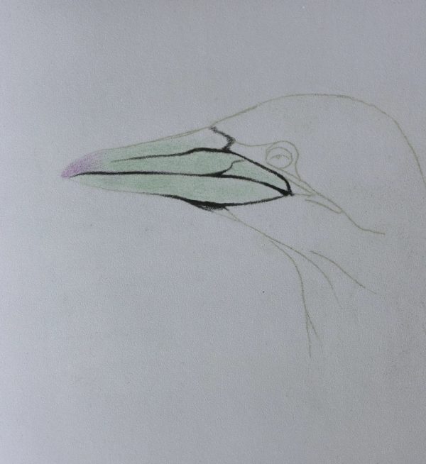
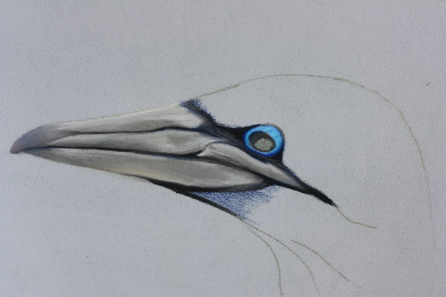
Begin with the 172, Earth Green, and using the flat side edge of the pencil, lightly shade in the beak but leave the tip. When you are shading with the flat of the pencil, you want to keep the application very soft so that you aren’t left with hard edges to blend in. You can achieve this by ‘brushing’ the pencil onto the page so that it is already moving before the pastel makes contact and continue moving the pencil whilst you lift it back off.
Next, use the 160, violet, to shade in the tip of the beak. This will give a warm tint to the end of the beak and the green, by comparison, is much cooler. We will be adding more green to the rest of the bird later on, too. It is good to have a mix of warm and cool colours interacting throughout a painting, it makes the whole ‘visual experience’ much more interesting and takes your art to the next level!
To finish this first step, use the 181, Payne’s Grey, to draw in those striking dark lines which cross over the beak and really define this bird. You’ll want the pencil to be quite sharp to get this line accurate, if you need a refresher on sharpening your pastel pencils, you can find one here.
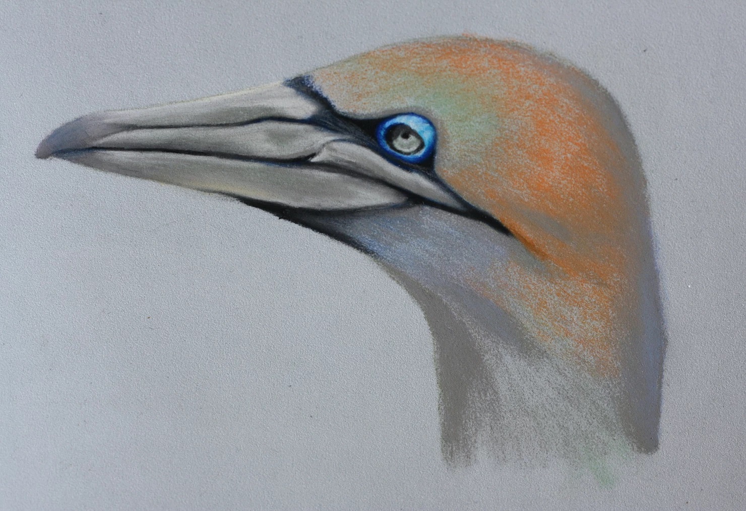
For the darkest area, (such as the gap between upper and lower beak), add in a touch of 199, black. You should end up with something like the photo below:
Step Two
Well done for completing the first step, this painting takes time to put together but pays off with a really professional finish at the end.
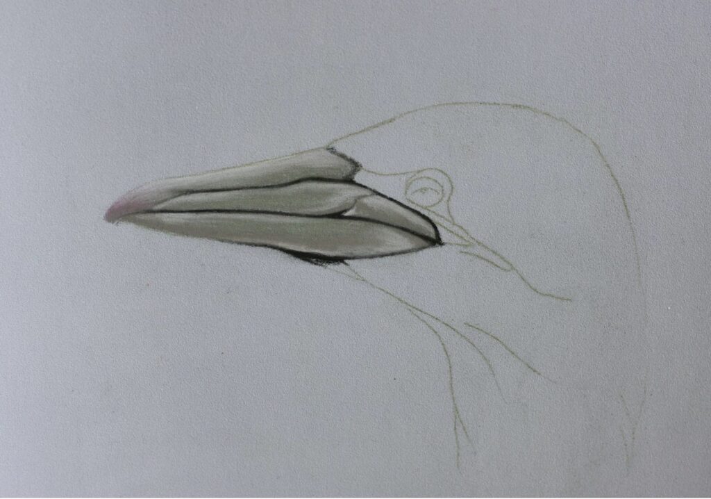
Now we will add the general grey of the whole beak using the 273, warm grey IV. Once again, you can use this pencil more like a brush on the side, but, you will want to add more pressure and begin to fill in the tooth, (grain), of the paper so that the blue of the card is gone.
You may find that a touch more of the green and purple is required, I often work back between the green and grey until I am happy with the balance of it. That is one of the main things to keep in mind when you’re following any type of tutorial; just because one step is ‘completed’ it doesn’t mean to say you cannot return to it! I do all of the time, I am always adjusting the colours, the lights and the darks and sometimes even the proportions as I go. This is because, much like colour transfer which I talked about in the previous post, when a new element is added into a painting the rest of the work so far appears to ‘shift’. Let’s say it was all in purple which looked fairly warm, but then we added a red, now the purple will look cooler. Perhaps the purple also looks darker, in comparison to the red, than we had intended; so keep looking and altering your work as you go.
Now that the beak is properly filled in, we need to bring it into the world of dimensions as it looks very flat right now. To do this, we are going to increase the range between the darks and the lights. Start with the 181, Payne’s grey, and use this to add in some shadows, (very lightly, you can shade back over the top with 273 to blend them out), and also redraw the dark markings on his beak. What we aim to do here, is nestle these darker marks into the rest of the beak so that the edges are a little softer and don’t appear to be stuck onto the beak as an afterthought. You can also run the 273, warm grey IV, along these edges like a blending tool and you’ll find the darker marks melt into the rest of the beak.
Time to add some highlights, I have called for both of the light greys which Faber Castell offer in this painting, because, one is warm (270) and the other is cool (230). If you have a quick think about which one should go where you can probably work it out; the cooler of the two is going to be on top of his beak where it reflects the blue of the sky. The warmer is going underneath his beach as it is catching a soft reflection from his slightly orange neck.
Of course, if you only have one light grey, just go for it! What I am aiming to do with these posts is open up my studio to you and share the ‘secrets’ which take a painting from ‘ok’ to ‘wow!’ It’s taken a long time to discover some of these little tricks, and whilst you don’t need to do them all, it can be nice to know what will progress a painting quite easily.
Step Three
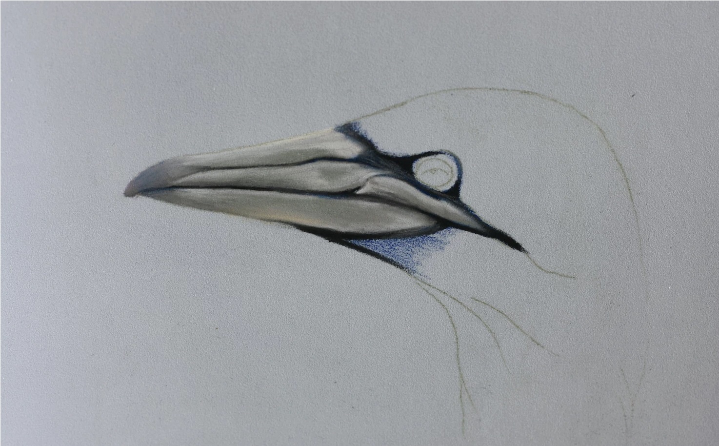
In true Emily style, I have taken quite some time to do something relatively simple, but, I like to get things done properly…even if that does mean 17 pencils for a small bird study… This step sees the completion of his beak, (which means we are nearly ready to put in that gorgeous eye!)
Start with the 151, Helioblue Reddish, and use this to colour in the dark skin which curves around his eye, (we are not using this on the very bright blue eyelid though). and down the side of his beak to the under of his beak. The reason we are colouring this in blue is not that it is blue, but, because it is the complementary colour to orange and his head is going to be in orange. The ‘relationship’ created between these two colours is visually exciting and will add more depth to your work. If you would like to know a little more about colours, read a simple introduction to them here. A flat grey would be relatively boring in comparison and we don’t want that, do we?
Overtop of this rich blue, we will tone it down with the 181, Payne’s grey, this will prevent is being too blue. Instead, it will have a shade of blue which is enough to offset the orange, (shade means black which has a colour mixed into it so that the black, or in this case dark grey, has a slight bias towards a colour. The terms for a white with a bias towards a colour is ‘tint’). Often it is the subtleties which make the work successful, it can be tempting to slap down blue and orange without altering their intensity, (also known as saturation), however, you’ll end up with a very busy and confusing painting.
To finish off this part of the painting, we will add a few lighter touches of 273, warm grey IV, to the skin which has small wrinkles under the eye. This stops it being too flat and you can have them emerging from under the eye to the beak which protrudes out into the light. You want to keep the deep areas of the eye socket dark, these areas will be different depending upon your reference, however, on my photo they were to the right and left of the eyeball.
Step Four
Ok, time to tackle something a little more exciting than his beak. Now we get to add in the electric blue eyelid, it really is the defining part of this painting even though it is such a small area. Depending upon your reference photo, your eye may be more blue/purple or blue/green. It’s ok either way, you can choose to follow your reference or follow my choices, or, use whichever pencils you have to hand.
If your blue is more purple than turquoise, I would advise making his plumage closer to yellow than orange. Why? Because purple and yellow are complementary colours, it keeps popping up this colour theory… Likewise, should your reference be closer to green than blue, his plumage should be a deeper orange and lean towards red, as red is complementary to green, (but we don’t want him looking like a post box either!). To understand this a little better, read more here.
Eyelid
I began with the 140, light ultramarine, to colour in the eyelid, both the light and the dark areas. This is giving us a general base colour and tone to work into and should ensure that the colours blend into it well which is important as this is a very small area to work in. You don’t want the blue of the card to show through.
Next, use the 151, helioblue reddish, to gently colour around the edge between the bright blue and the dark of his eye socket. This will act as a blending tool and gently ‘smudge’ these two areas together, eliminating the hard line between blue and dark grey.
After that, I glazed a small amount of the 156, cobalt green, on top of the blue, (glaze really means a thin and usually translucent layer of colour, however as we aren’t working in the paint here and cannot control the opacity, just put in a very thin layer). This nudges the blue towards green for the lighter areas, whereas, the 151 dark blue of the previous step is much warmer and leans towards red. This is all working hard to stop this blue looking flat as we have warm and cool blues, dark and lights, highly saturated blue next to desaturated dark grey; it is more interesting that just blue with a light and dark.
As I had it in my collection, I then also added the tiniest bit of Stabilo Carbathello light blue to the top of his lid, but this is not essential, I just have more blue pencils than anyone really needs…but they are lovely!
Eye Ball
Yep, still not finished with this step…the next step is also about the eye. We are now going to add in the base for the eyeball which we will work back into later.
Colour his eyeball in with the 273, warm grey IV, I left his pupil as a small spec so that I didn’t lose the placement of it, but, as it is black this isn’t strictly needed; the black pencil will happily sit over this grey.
Next, I added some little dots and dashes of the 172, earth green, to his iris which is actually very pretty. However, being that the eye is so small on this study, we don’t need to go into lots and lots of detail, you could also shade over the grey if this easier and this will shade it green.
Lastly, use the 181 Payne’s Grey to shade in the curved shadow which is cast by his eyelid. The position of the shadow may be different depending upon your reference photo, just make sure you stay true to one reference through this painting, either my drawing or your photo, I would recommend following your photo though.
Step Five
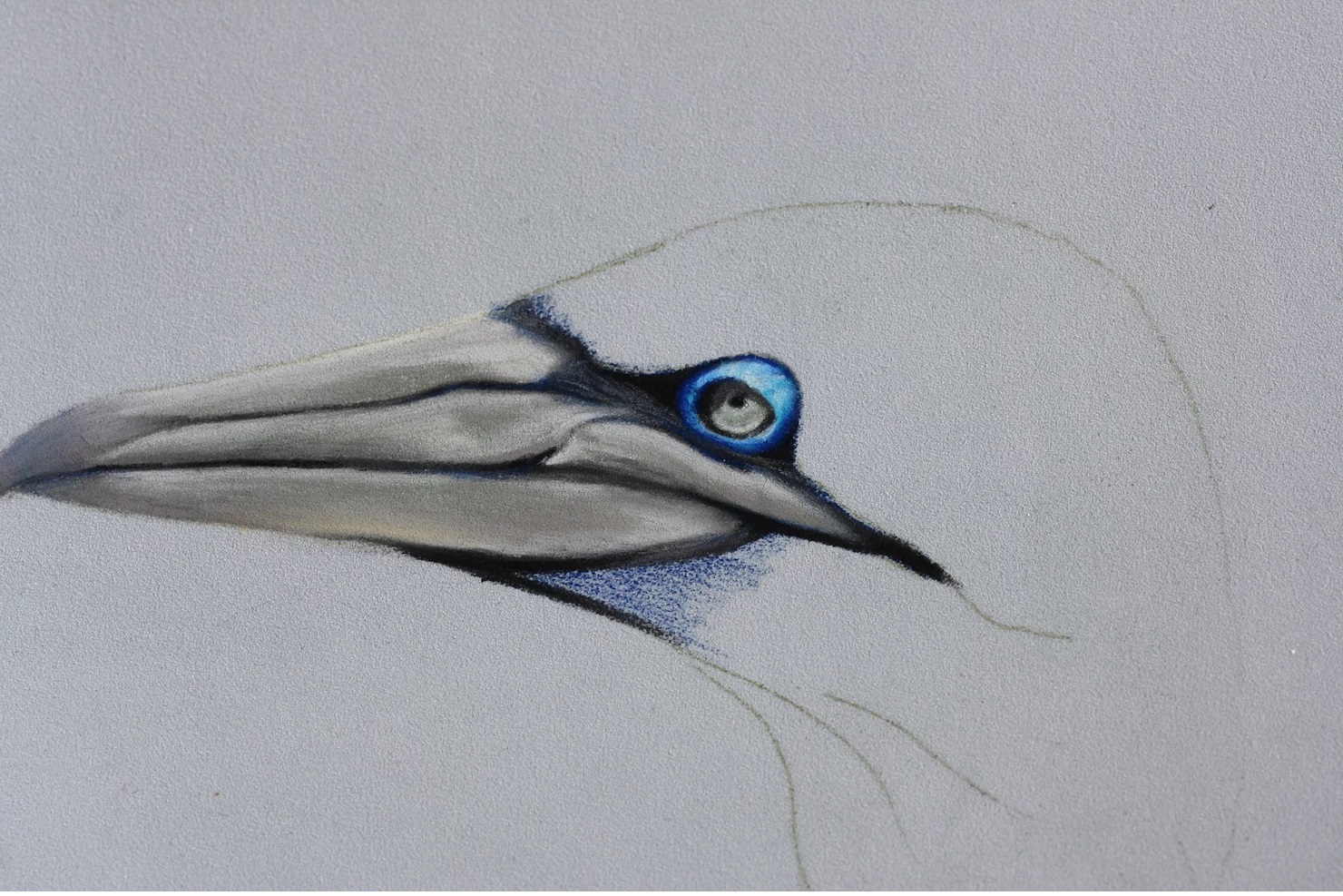
Let’s finish this eye and bring it into the sun! Start with the 199, black, and make sure it is nice and sharp as we are working in a very tight area and don’t want to have to deal with mistakes. I shaded in the shadow of his eye socket a little darker, (on top of the grey and blue mix we did a few steps ago) and then also outlined his iris, dragging a small amount of black into the shadow cast by his eyelid, too.
Then, take the 230, cold grey I, and use this on the eyeball to add in that small highlight on the bottom edge. You can see that this curved highlight around the rim of the iris, stops short of the shadow cast by his eyelid. I also added a small amount around his pupil as I could see a bright ring on my reference photo and by putting a light next to a dark, they contrast each other and the black appears even darker.
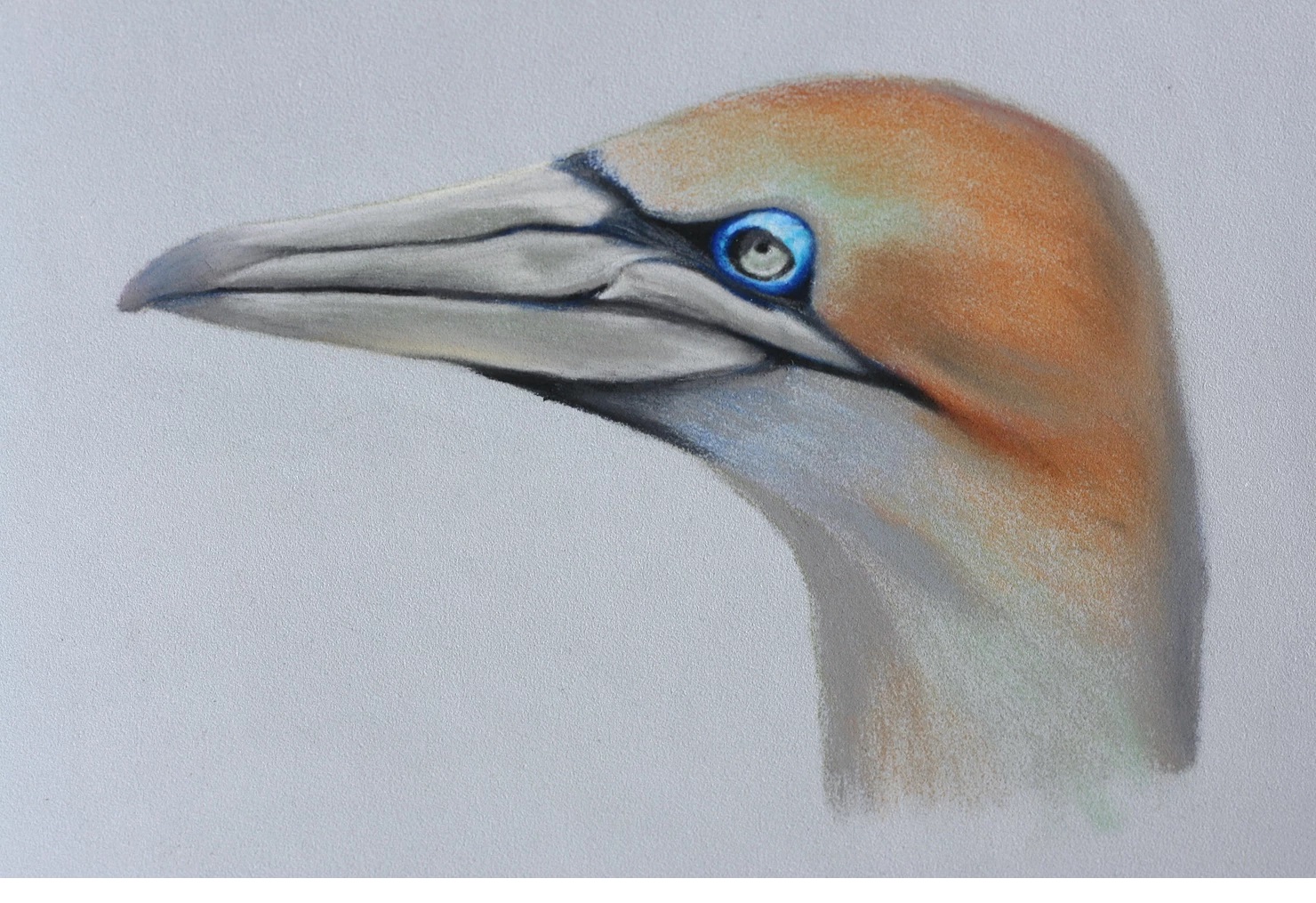
To finish, I used the same 230 to add a highlight onto his blue eyelid which brought that top edge out and forwards over his eyeball, this now makes better sense of the shadow it casts. You should have a finished, bright blue eye, similar to the photo below, well done!
Step Six
The beak is done, the eye is in, now we will begin work on his plumage and there are a few unexpected colours lurking here. If you have read my previous post on colour,you will know that the interaction of certain colours is exciting and interesting. Going along with the impressionist’s idea of colour transfer, (read about it here), we are going to make our shadows slightly blue to compliment the orange feathers on his head.
I am also going to be adding a little pink into his orange feathers, later on, and this pink will warm them up but be soft enough not to make the feathers red and completely the wrong colour. To work with the soft pink which we will add in later, I am going to add in more of the green used earlier. This is, once again, because green and red are complementary colours, (pink is red with white added to it) hence the green and pink will be ‘speaking’ to each other, the same as the blue and the orange. So, for those areas where the feathers change from yellow to white, I am going to put down some green pastel which will nudge the yellow towards green on the colour wheel (yellow is in between orange and green) and make it cooler.
You can see that the pastel is laid down nice and softly, even though we have all of this colour theory going on, it is subdued and not overstated. Begin with the 172, earth green, and use this for the areas where the feathers are going from that lemon yellow to white, use the flat edge of the pencil to do this.
Under his beak is in shadow, as is the back of his head, and so take the 140, light ultramarine, and once again use the side of the pencil to gently lay down some blue hue. You want all of these edges to be very soft so that the layers will ‘melt’ into one another. I also added some blue to the back of his head and neck which, too, was in shadow.
I then ‘warmed up’ the edges of the blue, (this is where the shadow is moving towards the light which is warmer), by shading in some 160, violet. Violet is a warmer colour, by comparison, to the blue and moves around towards red on the colour wheel.
Much like our work in the previous tutorials with shading, when we would move slowly from black to dark grey, to grey to light grey and, finally, white; we are moving in stages around the colour wheel. To get from the blue shadows to the orange head, we want to move from blue to violet, to red, (here we are using pink), then to orange, to yellow and even a little green. But, we aren’t jumping all over the place, putting blue right next to the orange, which would be a very big jump right across to the other side of the colour wheel.
Confused? Don’t worry, colour theory takes quite a lot of time to wrap your head around and people spend their whole artistic careers trying to understand it!
To finish off this first stage of underpainting – yes, there are more stages to the underpainting – take the 273, warm grey, and shade in the shadows on your painting. This will mean shading over top of the colours we have laid down, but their tint should be visible through the grey. Only in areas which are totally shaded have I pressed hard with the grey pencil. You should have something similar to the picture below, see how the colours are soft and not garish, the grey is helping to unify all of these colours for us.
Step Seven
I began with the 273, warm grey IV, here and shaded in the neck where the lighter feathers with eventually be drawn in. I was lighter of touch with the shading on this area though as it is in sunlight. I then also tinted this with a little more of the 172, earth green, for where the feather will be that lemon yellow which transitions into white.
It is finally time to get a little orange onto this painting! Once again, we won’t be pressing hard to apply this thin layer but instead using the side of the pencil. Where you can see the orange feathers, use the 187, Burnt Ochre, and shade in the same direction as the feathers. You can join this orange shading into the green and the shadows at the back of his head. However, you want to keep this light and don’t shade over the top of all of that green; we want to let it show through.
I also added in more 140, light ultramarine, to the shadows as I felt it was a little too weak now that the orange had been put in. See how your painting looks and judge these decisions as you go.
Step Eight
We can now begin to create more form on the head and will begin doing this with the 169,Caput Mortuum, which is a burnt purple colour. If you don’t have this, try a soft brown and it will have similar effects for you. I added the 169, to the areas of shadow within the orange plumage, over which, we will lay in some brighter feathers later on and this contrast will create depth and form.
Over the top of the 169, to help blend it in, and then into the orange, shade the 182, brown ochre. This will bring together the orange and the burnt purple and soften the transition between the two. The 182 is also darker than the orange colour and so you can grow and soften the shadows much more easily with it. The whole of the Gannet’s head is very smooth and creating these fine layers of pastel is key to achieving a likeness.
To finish, use the 173, warm grey IV, where it is needed to help soften the shadows and blend the different areas which you have added in together. I have avoided adding grey to the top of his head which is catching the sun, as we want these colours to be bright, crisp and vibrant. Adding grey to this area would reduce the colour and impact.
Step Nine
The fun part can finally begin, you’ve done well to persevere this far with those painstaking underpainting stages, they can take some time! Now that you are here though, I would suggest a tea or coffee break and a wedge of cake, you deserve a wedge. Come back with fresh eyes and you’ll do yourself justice on the final stages, it is worth it.
Had that tea and cake? Right then, let’s finish this Gannet study…
I started with the 186, terracotta, and making sure that I was following the direction of the feathers I began to put in the darker orange feathers. On my reference, these feathers were, generally speaking, around his cheek and the back of the head where it becomes cast in shadow.
For the next layer of feathers, use the 187, burnt ochre, and work over the top of your previous layer. Each new colour should run into the previous colour somewhat so that the whole head of feathers looks like one seamless flow. If you don’t mix the feathers up a bit, you’ll end up with something like a paint by numbers and you’re much better than that!
Working our way towards the yellow now, I used the pink I mentioned earlier which is number 132. This is a beautiful moment in the painting as it adds a fullness to the orange and also starts to ‘interact’ with the green you have already put down. It’s quite a creamy colour and this can be used to soften the next layer.
The next layer is with the yellow 184, but I find it quite harsh. I do sometimes use yellows from a different brand called Cretacolor, however, those can be tricky to get hold of individually, so, to keep things a little easier for you we will use the 184. It is a very bold and brass pencil, you don’t want to press too hard and if you think ‘oh gosh! It looks like LaLa!?’, then just go back over the yellow with a little of the 132, flesh pink and it will soften back out.
The final touch for this step is with the 102, cream, although I think it is much more lemon than cream, sorry Faber Castell I think you got it wrong! Either way, take this pencil and use it to bring the plumage forwards towards his beak, but not quite all of the way. This should be over the top of the green which we put down in the underpainting stages.
Step Ten
We are almost at the finish line now and you should be feeling very proud of yourself. Some people have posted their work from my previous tutorials on the Facebook Group and it’s brilliant, I’m going to need to watch my back! Do join the group if you’d like any feedback or inspiration.
Carrying on from the last step, use the 230, light grey, and using the same principle as before by working some grey into the previous layer, which was the 102 lemon, bringing the feathers forward to the beak. I also added some of this light grey around his eye and these blend into the yellow and orange there.
So, he’s looking very good but not quite bright enough yet I don’t think. Take the 101, white, and add a small number of white feathers to the grey area on the front of his head which is also catching the light. I also reestablished the highlight in his eye at this point.
To finish his head, I added a touch of the 273, warm grey IV, to the edge of his head as a very fine shadow. If you make too much of this, just go back over with the light grey, 230.
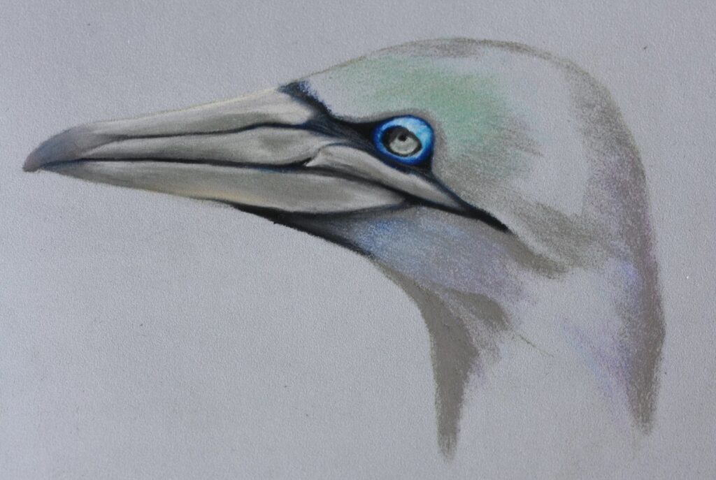
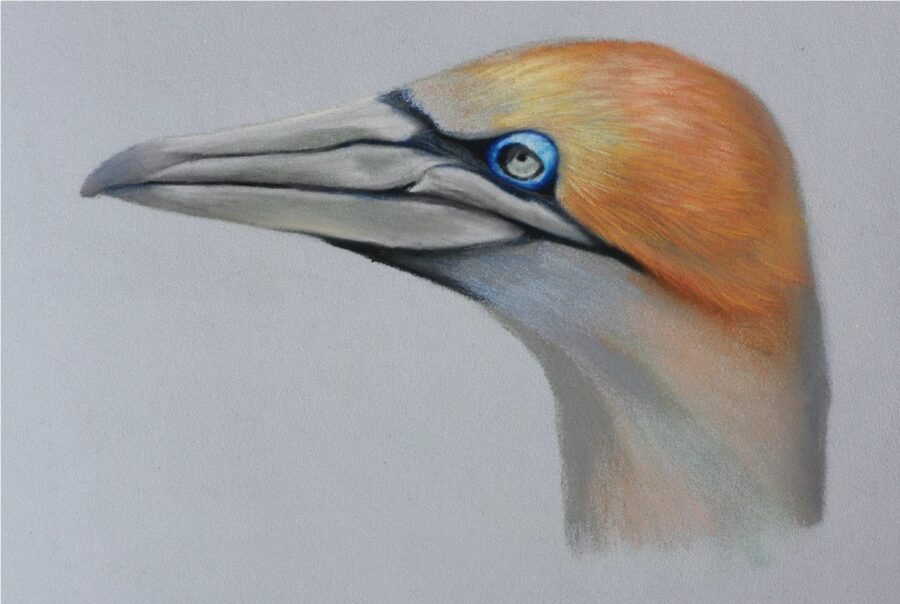
We are really getting there now, you should have something similar to the photo below, just the neck to go now!
Step Eleven
The last step, you have made it through my endless babbling and 17 pencils worth of confusing colours, well done.
You’ll be pleased to know that the last step is quite straight forward and you can take a little artistic licence with the colours here.
I started with the 230, light grey, and gently drew in the feathers under his beak which then flow down his neck very pleasingly. That is very important here, you need to keep the feathers flowing into each other so they sit flat. For those feathers in shadow, I tapped them back with my finger and they faded nicely into the underpainting. This makes sure that they aren’t too bright which would make the light source confused but equally, if we drew these white feathers which are in shadow in with the dark grey, they would just look like grey feathers.
I already have some green on his neck for where the yellow turns into light grey but I have also added in a little more of the 132, flesh pink. I just added this in for those areas where the orange is very soft compared to his head but the yellow pencil will be too bright by itself. You can see the pink in the photo on the previous step.
Working our way around the colour wheel again, use some of the 102, cream, and gently adding more feathers to his neck, keep looking at your reference photo for guidance, but, I added in a little more colour to his neck as I thought the creamy grey was a bit boring – shush! Just the same as the previous step, you can tap these feathers with a clean finger and they will soften and blend into the pastel.
Next, take the 184, yellow, and gently bring down the orange at the back of his head into his neck. I allowed this to fade out into the shadow which runs along the back of his neck. Just like before, I also used some of the 132, flesh pink, to reduce the intensity of the yellow as needed. While you’re here, you can also bring a small hint of yellow to the underside of his beak which is picking up a small amount of reflection from his feathers. There’s a lot of little details in here, aren’t there?
If you need to, you can add a touch of orange into his neck with the 186, terracotta, it depends on the balance of your own painting as to whether you think this is needed.
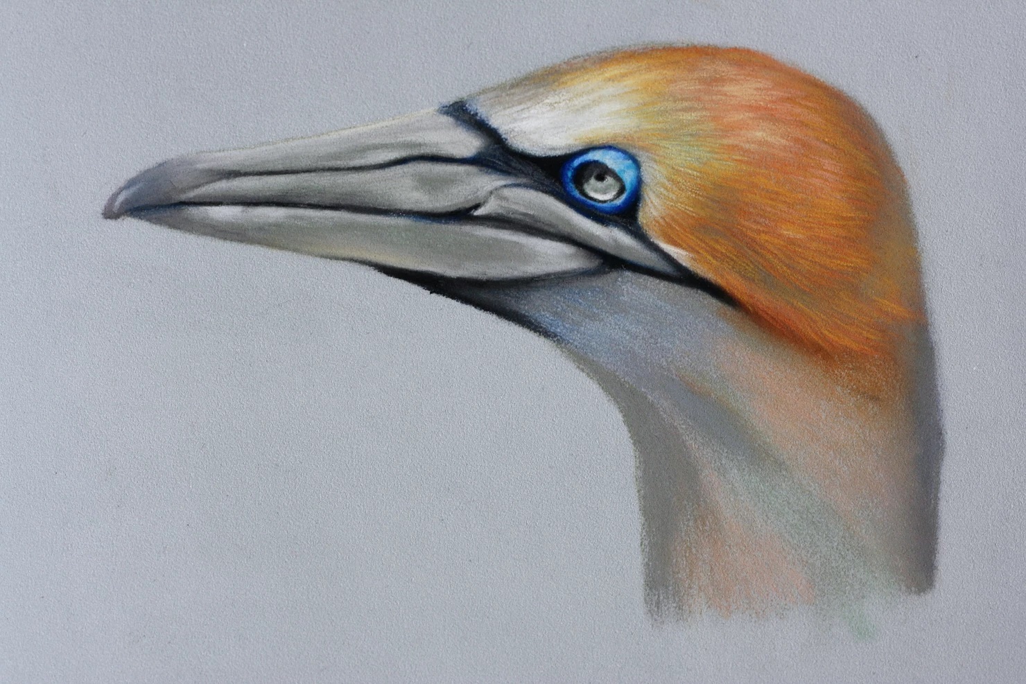
Finally, to finish him off, take the white and bring a touch of light to those brightest feathers on his neck which are catching the sun. This should give you a rounded neck with the shadow work which you have already done and also help to define the direction of his feathers.
Stuck for where to begin?
Start with 4 free project outlines, ready to begin in pastel pencils straight away!
Keep your pastel pencil knowledge up to date!
Stay inspired and keep your pencil moving with inspiration and updates.
Don't worry, your information will not be shared.
We hate SPAM. We will never sell your information, for any reason.
