
White Fur: Incredible How to with Pastel Pencils
Jun 05, 2024
White fur is tricky. Very tricky. You may think initially that it would surely be easier than colour; there’s less to do and only a few pencils to use. However, this is exactly the problem; there isn’t much to play with and a lot to describe.
How I Draw White Fur and Feather
Let’s begin by looking at some examples and seeing what I have done to create each one. Then we can break down each element of successful white fur drawing to get the key concepts.
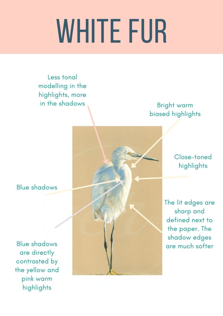
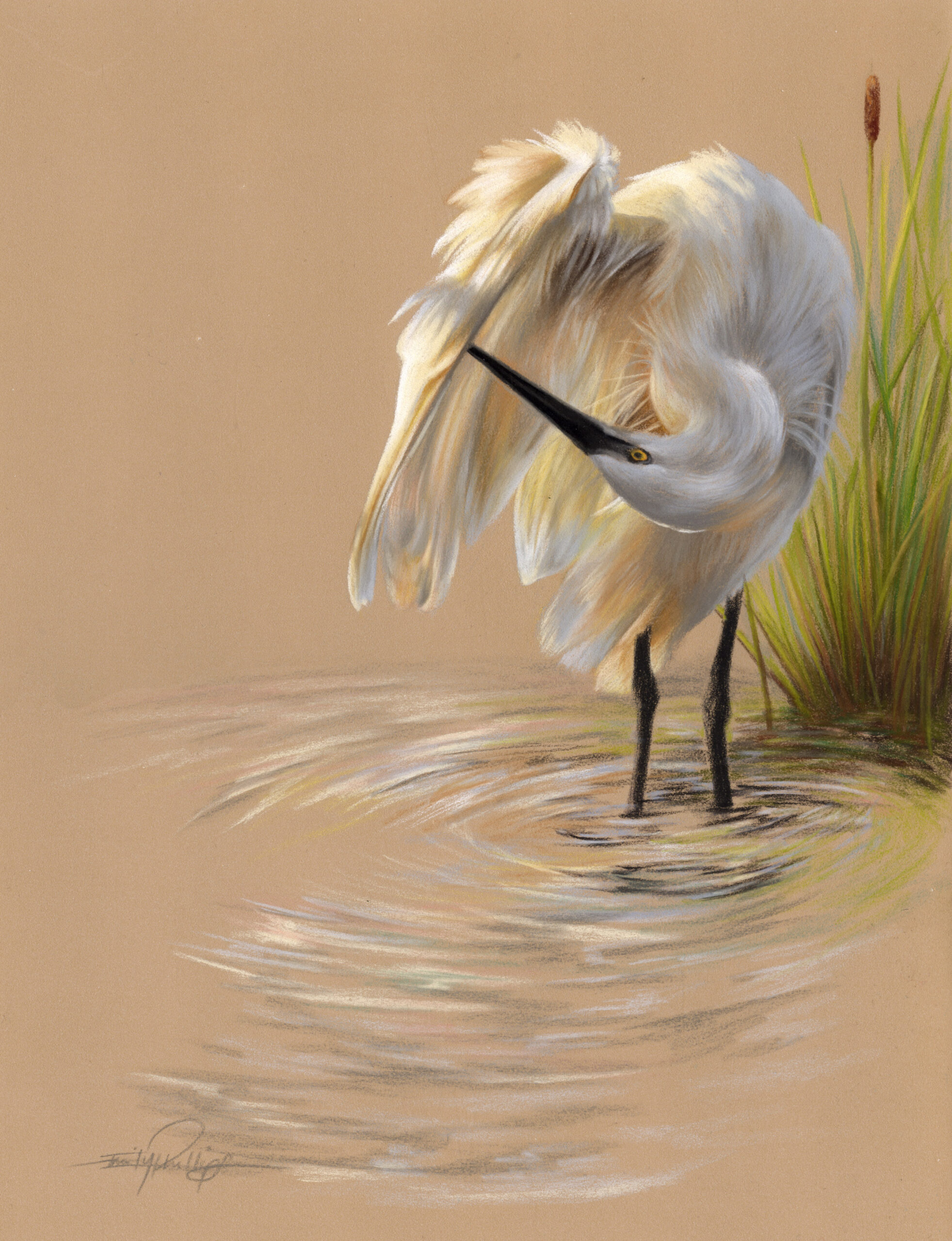
The first example is from an Egret drawing, in pastel pencils, which has a major focus on blue shadows. Creating colours in white fur is always a must, as, without them, it becomes very dull. We will look at the best colours to add in later on. Our next example…
What do You See?
What you should be seeing is that there are strong similarities between these to drawings. Although one is white feather and the other white fleece and fur, I use similar methods.
With realism, you need these key methods to lead you and provide a framework. These methods will take your work from amateur to professional – as well as a little practice.
We are now going to go through each element step by step so that you can use them properly in your drawings. It’s one thing to know an idea, but you need to understand it to properly use a method or technique and really make it work.
The Underpainting for White Fur, not Muddy Fur!
The first task is: underpainting which gives us enough structure that we have a good shape, but, it isn’t so dark that the white hairs are going to mix into it. If the white hairs mix into the underpainting, our subject is going to get pretty dirty looking!
If we make a pastel underpainting very thick, it will smudge together nice and easily. This will cover the tooth of the paper fully so that we can’t see the paper anymore. Dense underpaintings are good for some drawings, however, with white fur we need more of the tooth of the card available so it doesn’t mix into ‘mud’.
‘More Tooth’, means that the grain of the card which traps the pastel is quite open and can take more layers. If we use up a lot of this grain early on, those top layers are going to mix and the white fur, as I keep saying, becomes muddy.
Because we want a thin underpainting, we must be comfortable with parts of the original board showing through here and there. So, the next big point…
How to Choose Your Paper Colour for Drawing White Fur
I work on Clairefontaine pastelmat board or paper and this comes in a variety of colours. To help me choose which is the right one for a drawing I have to consider a few things:
- Overall, is the subject a ‘warm’ or a ‘cool’ temperature?
- Is the subject well lit?
- Where is the location, is it outdoors?
- Is the skin showing through the fur and if so, is it dark?
These questions will help me choose the correct paper, let’s look at an example.
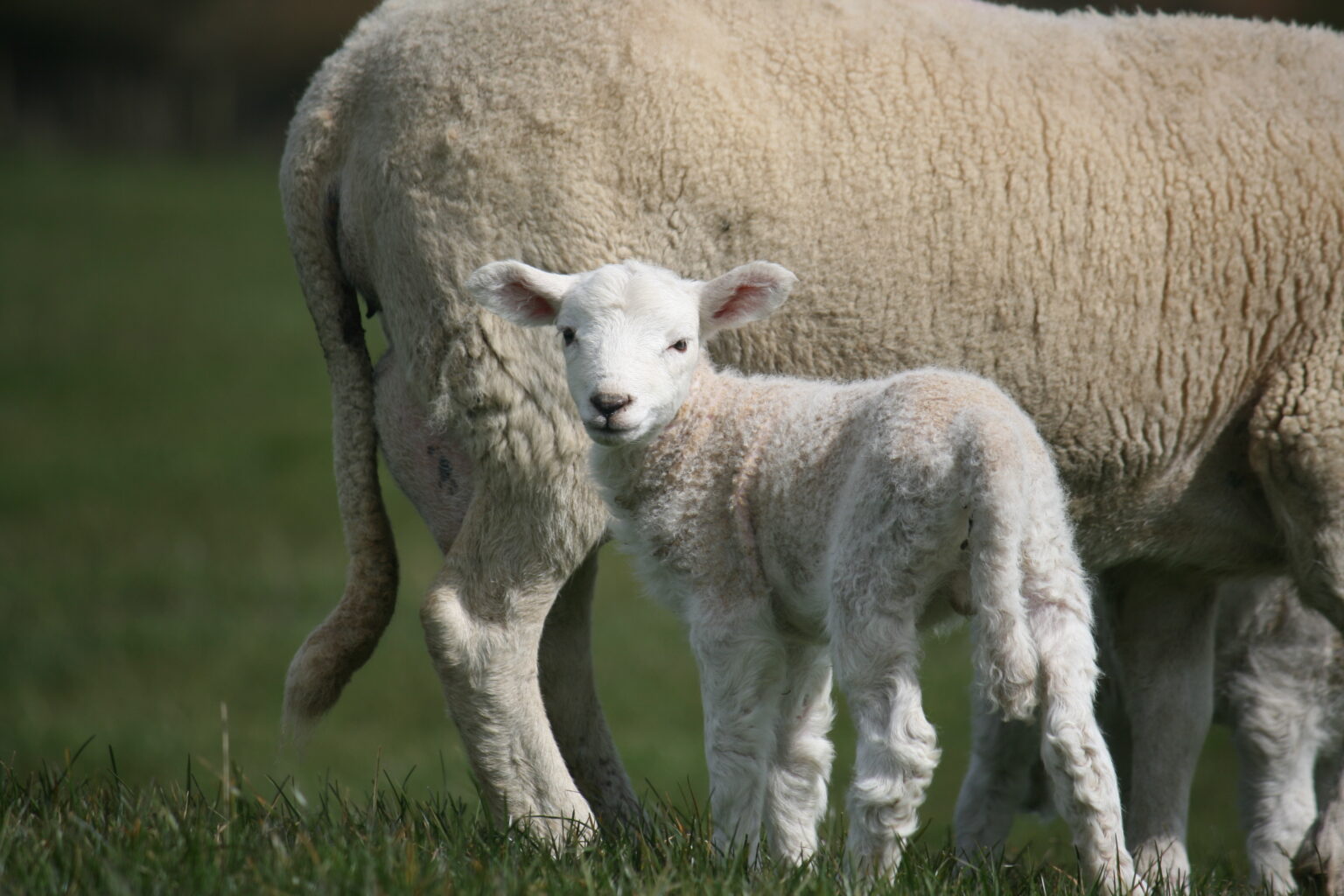
- Overall, is the subject a ‘warm’ or a ‘cool’ temperature?
This is fairly neutral; the fur itself is a warm brown, however, the area in shadow is quite a flat brown. This whole photo is a bit ‘boring and bland’.
- Is the subject well lit?
Partly, the highlight is strong but is backed by a warm tone which doesn’t make it stand out much. The shadows are all very soft.
- Where is the location, is it outdoors?
Yes and I intend to add grass!
- Is the skin showing through the fur and if so, is it dark?
Not very much, we have pink in the little ears, nose and eyelids but the rest is a dense fleece with lots of grey-browns.
What this Means for the Drawing…
Overall, we have more warm than cool and quite a bit of neutral grey. A cooler card would help to add more variation in tone, a warmer card would give the opportunity to make the shadows much cooler.
The subject is well lit on one side but needs something to help contrast the highlight which is warmish – a cool background would help to maximise this contrast!
It’s outdoors and a blue would add to this as I intend to add grass.
Not very much of the skin is on show, however, the underpainting for the shaded areas can be fairly thick as the details are soft and grey, not white.
All of this tells me that the light grey paper would work to add more interest to this piece. The sand wouldn’t have added much and might have made the study a little ‘same same’.
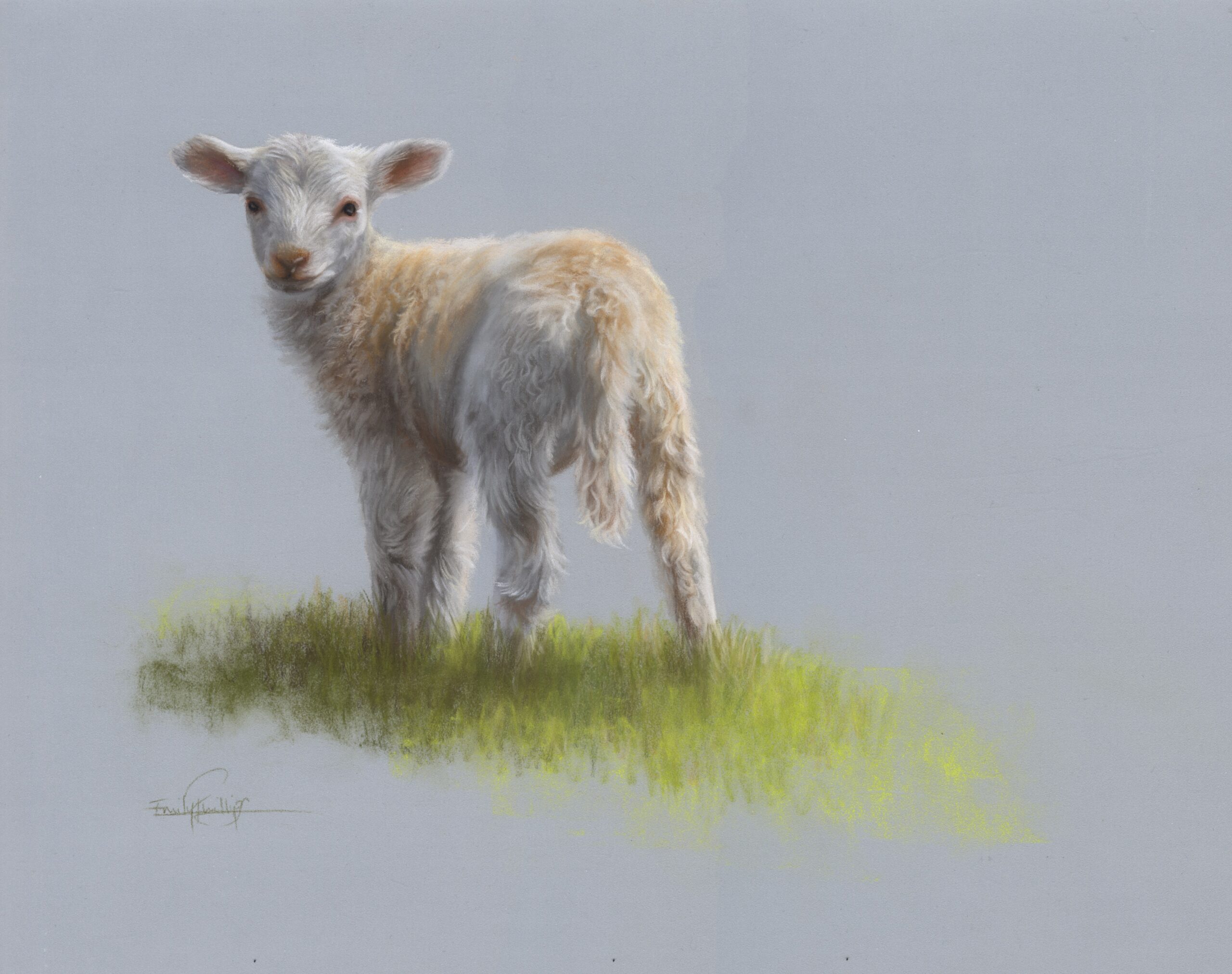
Lost Edges and Sharp Edges
The above drawing shows a lot of outlining with a thick grey pastel – thick was a purposeful style choice, however, it serves as an excellent example here!
You don’t want to need to outline your piece to make it ‘show up’. This is why you need to pick the correct card colour to start with and always make sure it is dark enough that the white is properly bouncing against it.
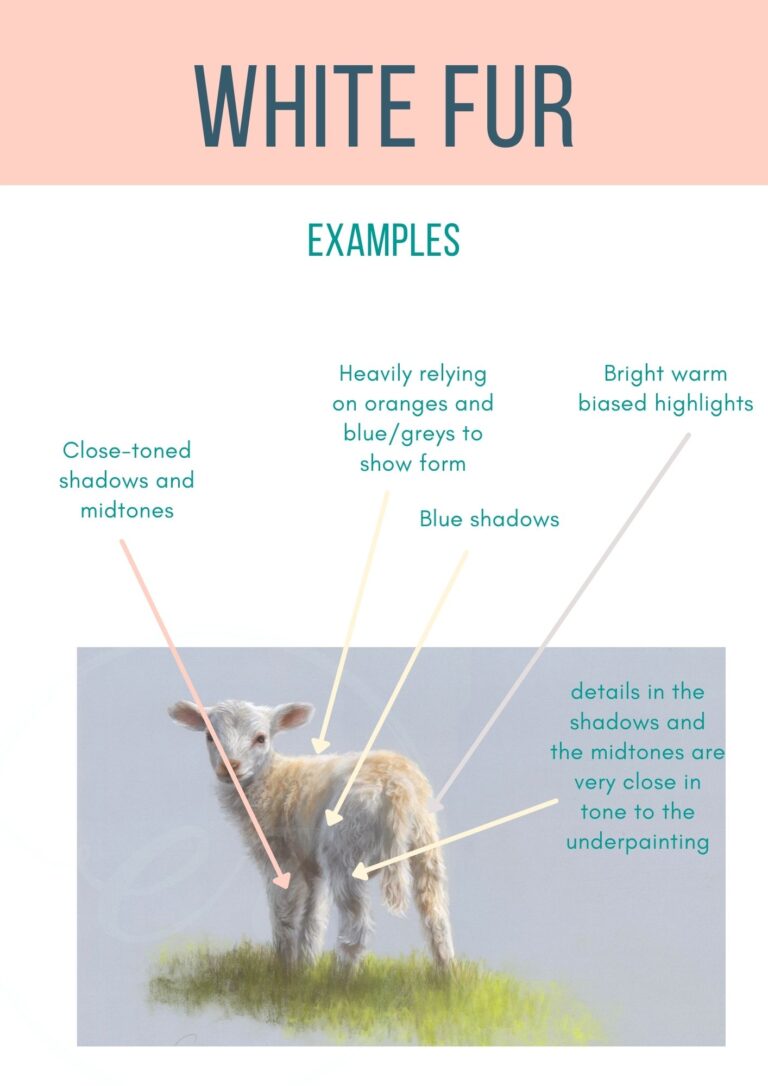
Remember that white is as light as you can go, so, to make it shine out create the rest of the painting a bit duller, even if the photo says otherwise. Here, the mother is much darker which helps to add a delicacy to the lamb and direct our focus to her.
For white fur drawings, I like to have the white fur as the ‘sharp’ or ‘found’ edge and the shadows and midtones to be much quieter in comparison. The midtones and some edges can be softly fading out into the board which helps to focus us back to those ‘sharp’ areas.
So, give a bit of thought to where you want to be a focal point in your drawing. If you know where it is, try softening the other edges which aren’t as important and see how your eye goes to the sharper areas!
You’re Hot and Cold
Our ‘secret weapon’ for the white fur is to introduce some colour! What? Colour in white? Well, yes, sort of. We are going to use desaturated colours, I have a post about those here. For the purpose of this post, however, we are using colours mix with white for the highlights so that they are very light and faint.
I like to use an ivory pencil, Faber Castell 103, a Carbothello ‘Cold Grey II’, which is like a blue grey and some very light pinks, too. All of these colours are very light and very faint in colour, however, as you can see above, they are different when next to eachother.
Because we only have a few grey pencils, it’s quite important to get some extra interest into our drawings. Also, two light grey pencils and one white pencil isn’t really enough to draw a whole subject with! These extras give us at least four or five extra options.
I like to use these warmer colours in the highlights, (a bit of blue here and there is nice, too!), and then the cooler colours generally in the grey shadows.
Stuck for where to begin?
Start with 4 free project outlines, ready to begin in pastel pencils straight away!
Keep your pastel pencil knowledge up to date!
Stay inspired and keep your pencil moving with inspiration and updates.
Don't worry, your information will not be shared.
We hate SPAM. We will never sell your information, for any reason.
